50 Kitchen Backsplash Ideas for 2027: Beautiful Designs for Every Style and Budget
Discover 50 stunning kitchen backsplash ideas for 2027: timeless subway tile, handmade zellige, dramatic marble slabs, colorful patterns, and budget-friendly updates.
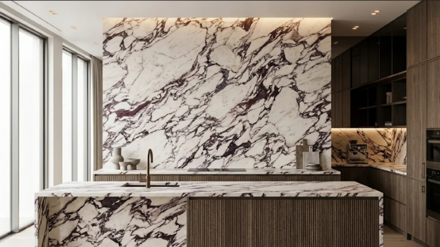
What Kitchen Backsplash Styles Make Sense for 2027?
The strongest direction for 2027 is personality without unnecessary clutter. Warm whites and beiges, textured handmade-look tile, deep green accents, and stone-look surfaces all offer ways to give the backsplash a distinct role while keeping the rest of the kitchen functional.
This is more than guesswork. The National Kitchen & Bath Association's 2027 Kitchen Trends Report indicates strong enthusiasm for neutral colors, greens, blues, natural wood cabinets, and layered lighting. In the Houzz 2026 Kitchen Trends Study, tile remained common at 72% of renovations, while slab backsplashes gained significant share at 28%. Those reports describe recent homeowner preferences and designer expectations—they don't mean every kitchen needs an expensive, trend-led renovation.
Backsplash Style & Priority Selection Matrix
| Priority | Recommended Backsplash Style | Key Consideration Before Buying |
|---|---|---|
| Timeless & Versatile | White subway, ivory stack, soft herringbone | Grout color changes the entire visual effect |
| Warm & Organic | Moroccan zellige, honed travertine, sage ceramic | Texture, shade variation, and sealing needs |
| Minimal Seams | Natural stone, quartz, or porcelain slab | Fabrication, wall flatness, and heat clearances |
| Easy Routine Cleaning | Smooth glazed ceramic, porcelain, tempered glass | Joint count, grooves, and surface finish |
| Color Without Overwhelming | Sage green, dusty blue, muted olive | Daylight angles and cabinet undertones |
| Temporary Rental Update | Heat-approved peel-and-stick panels | Heat clearance, wall preparation, removal terms |
| Statement Focal Point | Bookmatched marble, patterned tile, hand-painted inset | Layout planning and long-term visual balance |
Design shortcut: Pick your countertop first if you are replacing it. Its pattern and undertone influence almost every backsplash decision. If you are keeping the existing countertop, use it as the fixed reference point for selecting samples.
Classic White Subway Tile
White subway tile remains a reliable choice because it works with Shaker cabinets, painted cupboards, and simple modern fronts. A 3-by-6-inch brick pattern feels traditional; a longer rectangle with slim joints reads more contemporary.
For warmth, choose a soft white rather than a blue-white glaze and pair it with an off-white grout. If your kitchen already has busy stone countertops, this is an especially useful way to give the eye somewhere quiet to rest.
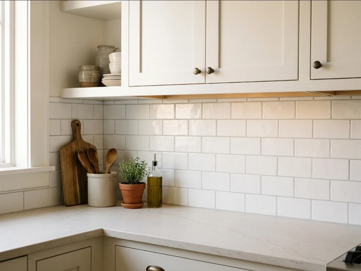
Idea 1: Classic White Subway Tile — balancing tactile material texture and practical kitchen durability.
BEST FOR: Coordinating with natural wood and neutral cabinetry. PRO DESIGN TIP: Bring physical tile and grout samples home to inspect under morning and evening task lighting before ordering.
Ivory Stacked Ceramic Tile
Stacking rectangular ivory tiles in straight rows creates an orderly background that still has subtle texture. The arrangement pairs beautifully with flat-front cabinets and light oak, and it can make a small kitchen feel calmer than a busy mosaic would.
Order actual samples: ivory can lean pink, yellow, or gray under different bulbs. Match the undertone to your countertop, not to the showroom display. A narrow grout joint keeps the finished wall visually connected.
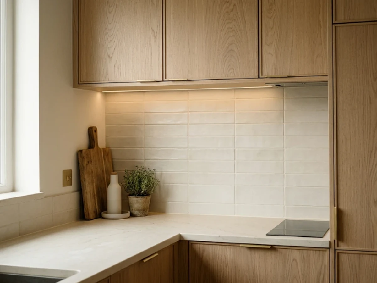
Idea 2: Ivory Stacked Ceramic Tile — balancing tactile material texture and practical kitchen durability.
BEST FOR: Coordinating with natural wood and neutral cabinetry. PRO DESIGN TIP: Bring physical tile and grout samples home to inspect under morning and evening task lighting before ordering.
Pearl-White Zellige Tile
Handmade Moroccan zellige brings a softly irregular surface, which catches daylight in ways perfectly flat tile does not. Pearl-white and milky finishes work especially well in understated kitchens where the wall needs texture rather than a bold pattern.
Expect natural variations in edge, thickness, and shade. Ask for a mock-up and an installer familiar with the tile you select; many handmade products need special setting and grout decisions. Use smaller lighting accents instead of cluttering this already expressive surface.
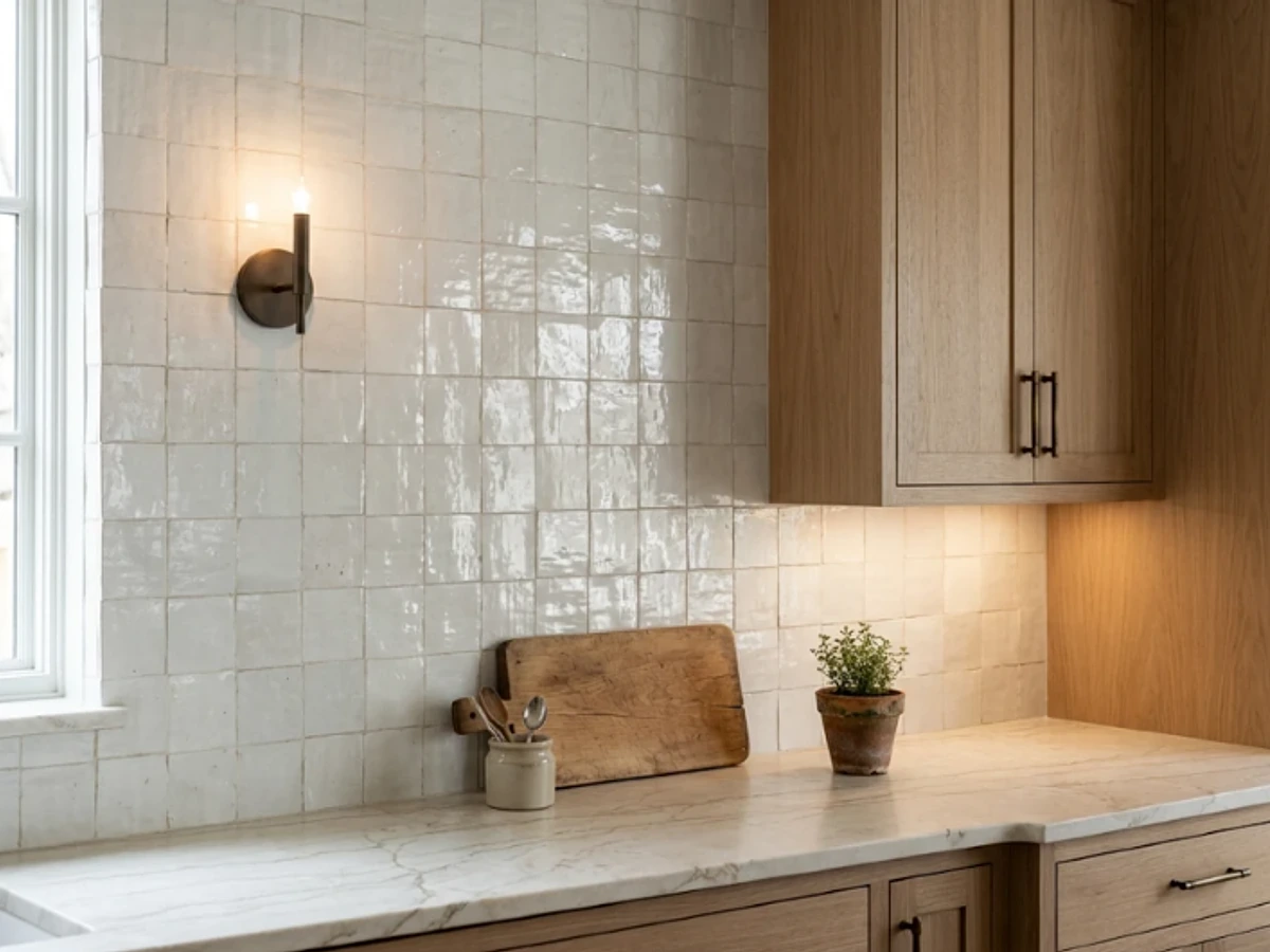
Idea 3: Pearl-White Zellige Tile — balancing tactile material texture and practical kitchen durability.
BEST FOR: Coordinating with natural wood and neutral cabinetry. PRO DESIGN TIP: Bring physical tile and grout samples home to inspect under morning and evening task lighting before ordering.
Sand-Beige Matte Tile
A sandy beige backsplash is a gentler alternative to stark white, especially alongside walnut, warm greige, or mushroom cabinetry. The matte finish minimizes reflections and lets metal fixtures and wood grain provide the visual contrast.
Choose a tile with a slight tonal variation so a large wall does not look flat. Bring a sample home and check it beside the cabinet at morning and evening light; some beiges can turn unexpectedly peach-colored.
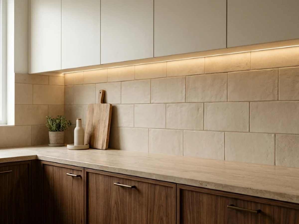
Idea 4: Sand-Beige Matte Tile — balancing tactile material texture and practical kitchen durability.
BEST FOR: Coordinating with natural wood and neutral cabinetry. PRO DESIGN TIP: Bring physical tile and grout samples home to inspect under morning and evening task lighting before ordering.
Cream Vertical KitKat Tile
Slim cream-colored finger tiles draw the eye upward and can make the space between counters and cabinets feel taller. Their repeated lines work well with simple oak fronts, rounded hardware, and sculptural pendant lights.
The narrow format introduces more grout lines, so ask how the chosen tile and grout should be cleaned. For a cooking wall that sees frequent splashes, consider keeping the fluted effect for a coffee station and selecting smoother tile behind the range.
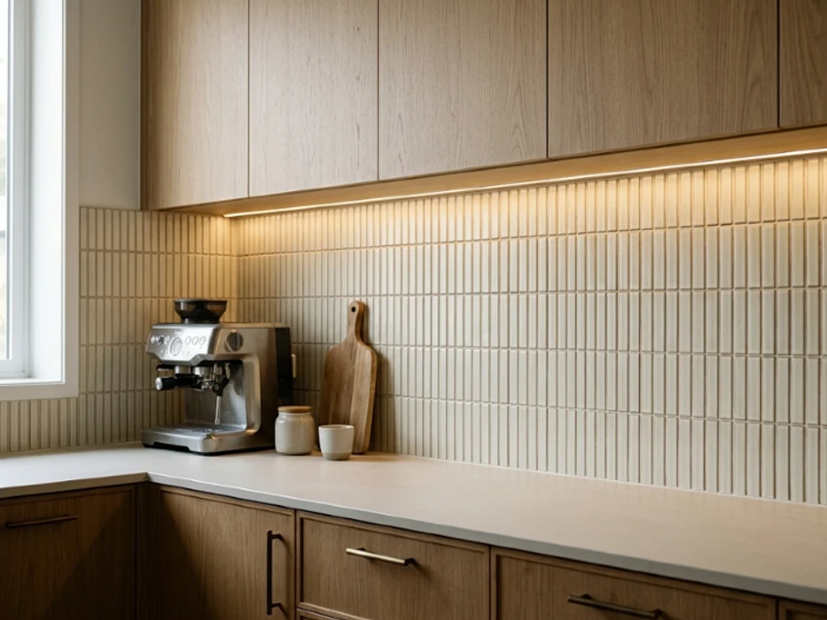
Idea 5: Cream Vertical KitKat Tile — balancing tactile material texture and practical kitchen durability.
BEST FOR: Coordinating with natural wood and neutral cabinetry. PRO DESIGN TIP: Bring physical tile and grout samples home to inspect under morning and evening task lighting before ordering.
Large-Format Greige Porcelain
Greige porcelain gives you the warmth of beige with a gray undertone and fewer visual interruptions than small tile. A large-format tile can be particularly effective in an open-plan kitchen where the backsplash must sit comfortably beside a living area.
Pay attention to wall flatness and edge alignment. Larger tiles can highlight uneven substrates, and cuts around outlets become conspicuous. A coordinated grout creates a nearly continuous look without committing to a full slab.
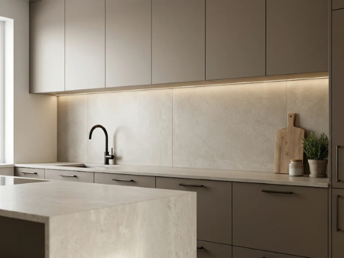
Idea 6: Large-Format Greige Porcelain — balancing tactile material texture and practical kitchen durability.
BEST FOR: Coordinating with natural wood and neutral cabinetry. PRO DESIGN TIP: Bring physical tile and grout samples home to inspect under morning and evening task lighting before ordering.
Soft White Herringbone
For a classic kitchen that needs a little movement, arrange plain white rectangles in a herringbone pattern. The repeated zigzag looks refined without competing with patterned flooring or veined countertops.
Plan the layout around the range and the main sight line so the pattern appears centered rather than abruptly cut off. This design typically involves additional cuts and installation labor compared with a straightforward running bond.
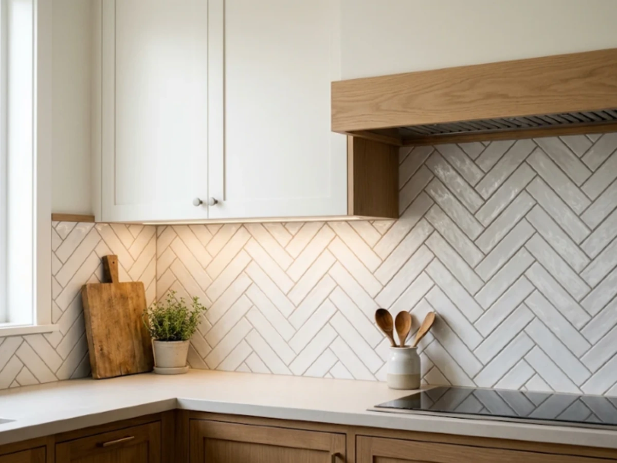
Idea 7: Soft White Herringbone — balancing tactile material texture and practical kitchen durability.
BEST FOR: Coordinating with natural wood and neutral cabinetry. PRO DESIGN TIP: Bring physical tile and grout samples home to inspect under morning and evening task lighting before ordering.
White Tile with Dark Grout
White ceramic tile with charcoal grout makes every brick line visible, adding graphic structure to a modest kitchen. It suits industrial accents, black windows, and simple cabinets, especially when the rest of the finishes are restrained.
Choose this deliberately: dark grout can make a backsplash look busier and may show mineral deposits differently from pale grout. Request a real grouted sample before choosing the contrast level.
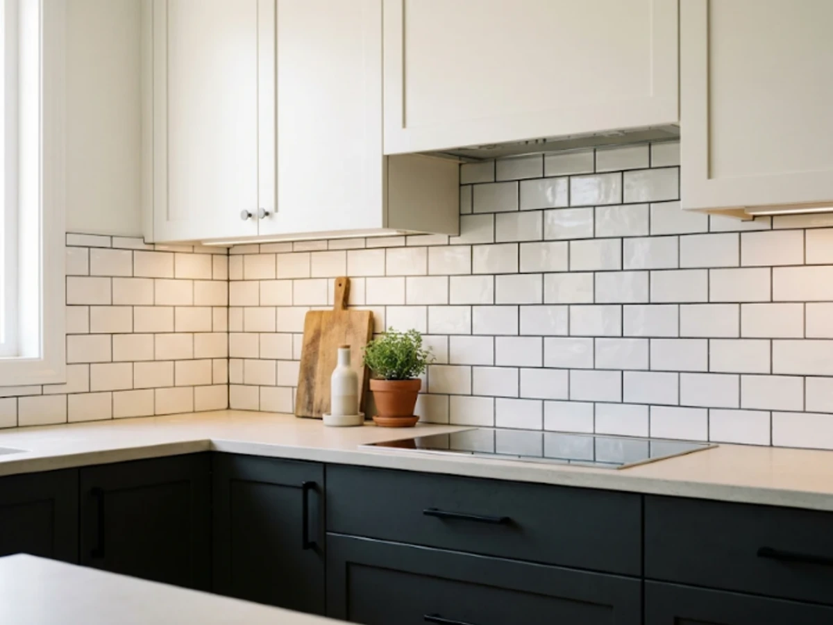
Idea 8: White Tile with Dark Grout — balancing tactile material texture and practical kitchen durability.
BEST FOR: Coordinating with natural wood and neutral cabinetry. PRO DESIGN TIP: Bring physical tile and grout samples home to inspect under morning and evening task lighting before ordering.
Ivory-and-Sand Checkerboard
A checkerboard does not have to be stark black and white. Alternating ivory and sand square tiles makes a friendly, retro-inspired backsplash that still coordinates with contemporary oak or painted cabinetry.
Use a tight tonal range to keep the pattern soft, or increase contrast for a bolder effect. This is a good feature wall for a breakfast nook, with quieter tile elsewhere if the kitchen has many cabinets and appliances.
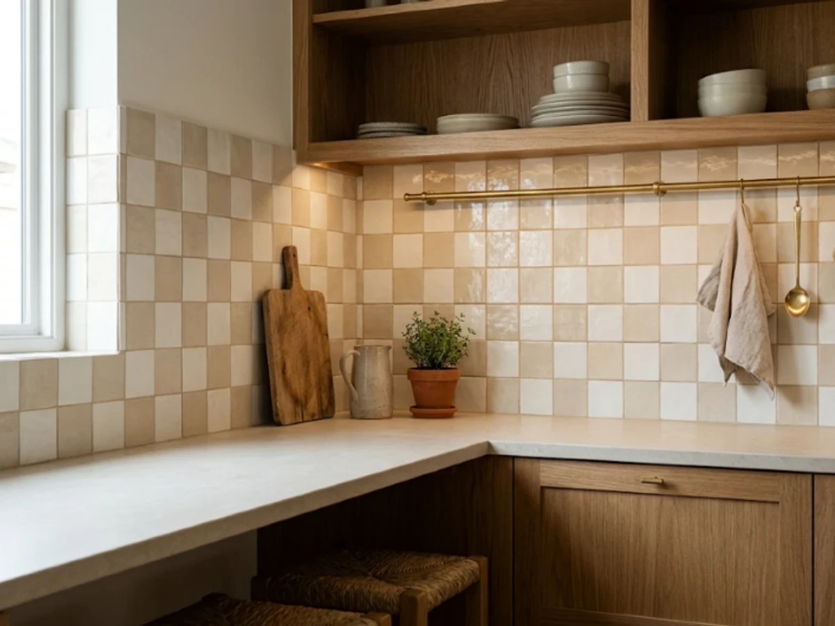
Idea 9: Ivory-and-Sand Checkerboard — balancing tactile material texture and practical kitchen durability.
BEST FOR: Coordinating with natural wood and neutral cabinetry. PRO DESIGN TIP: Bring physical tile and grout samples home to inspect under morning and evening task lighting before ordering.
Limewash-Look Porcelain
If you like the chalky, layered look of plaster but want a tile surface behind a sink or cooktop, porcelain with a limewash-inspired print offers a practical alternative. The effect feels especially natural with pale timber, aged brass, and simple stone-look worktops.
Inspect several tiles together to make sure the printed variation does not repeat too obviously. Confirm the product is approved for wall installation and ask for the manufacturer’s cleaning instructions.
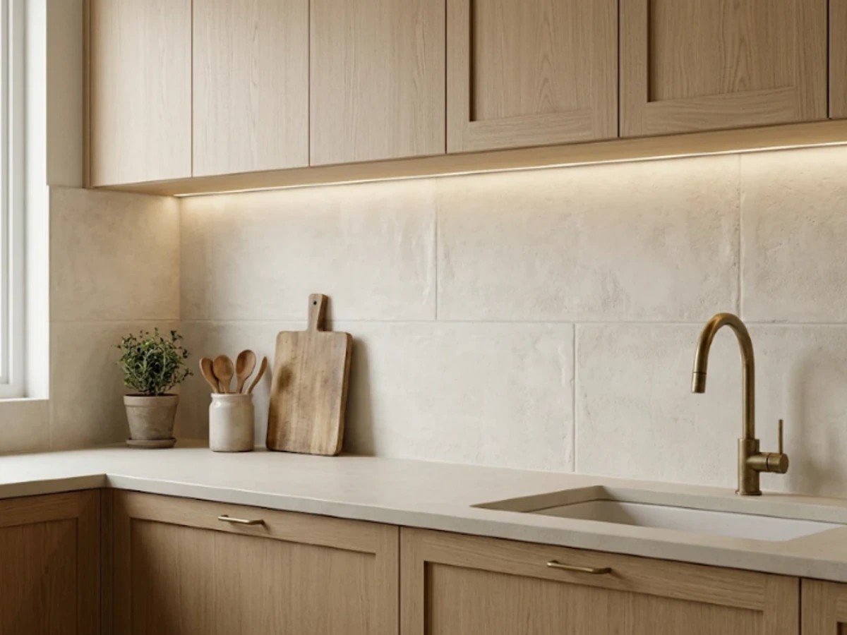
Idea 10: Limewash-Look Porcelain — balancing tactile material texture and practical kitchen durability.
BEST FOR: Coordinating with natural wood and neutral cabinetry. PRO DESIGN TIP: Bring physical tile and grout samples home to inspect under morning and evening task lighting before ordering.
Dramatic Veined Marble Slab
A full marble slab turns a working wall into a focal point, especially when bold veins continue upward from the countertop. This is particularly striking behind a simple range hood and uninterrupted cabinetry.
Marble requires realistic care expectations: acidic splashes may etch and some products need sealing according to the fabricator’s guidance. Review the exact slab in person, including cutouts and vein direction, before fabrication begins.
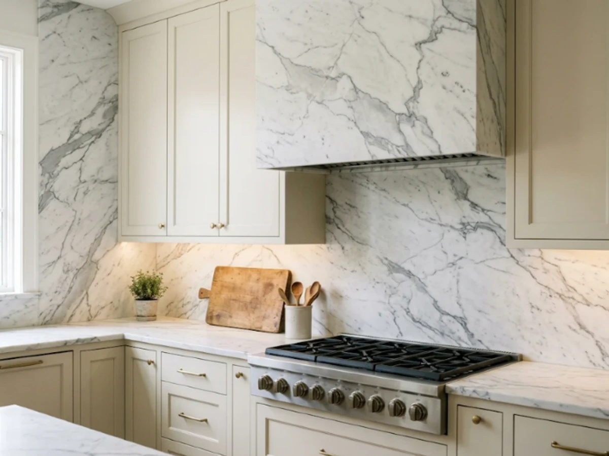
Idea 11: Dramatic Veined Marble Slab — balancing tactile material texture and practical kitchen durability.
BEST FOR: Coordinating with natural wood and neutral cabinetry. PRO DESIGN TIP: Bring physical tile and grout samples home to inspect under morning and evening task lighting before ordering.
Honed Quartzite Backsplash
Natural quartzite can combine expressive movement with a less glossy, honed finish. It is a beautiful partner for natural oak, mushroom cabinetry, and understated bronze details. Each slab is different, which is part of the appeal.
Ask the stone supplier to confirm the specific material classification, finish, maintenance, and recommended protection. Do not assume every stone marketed as quartzite behaves identically, especially with acids or oil.
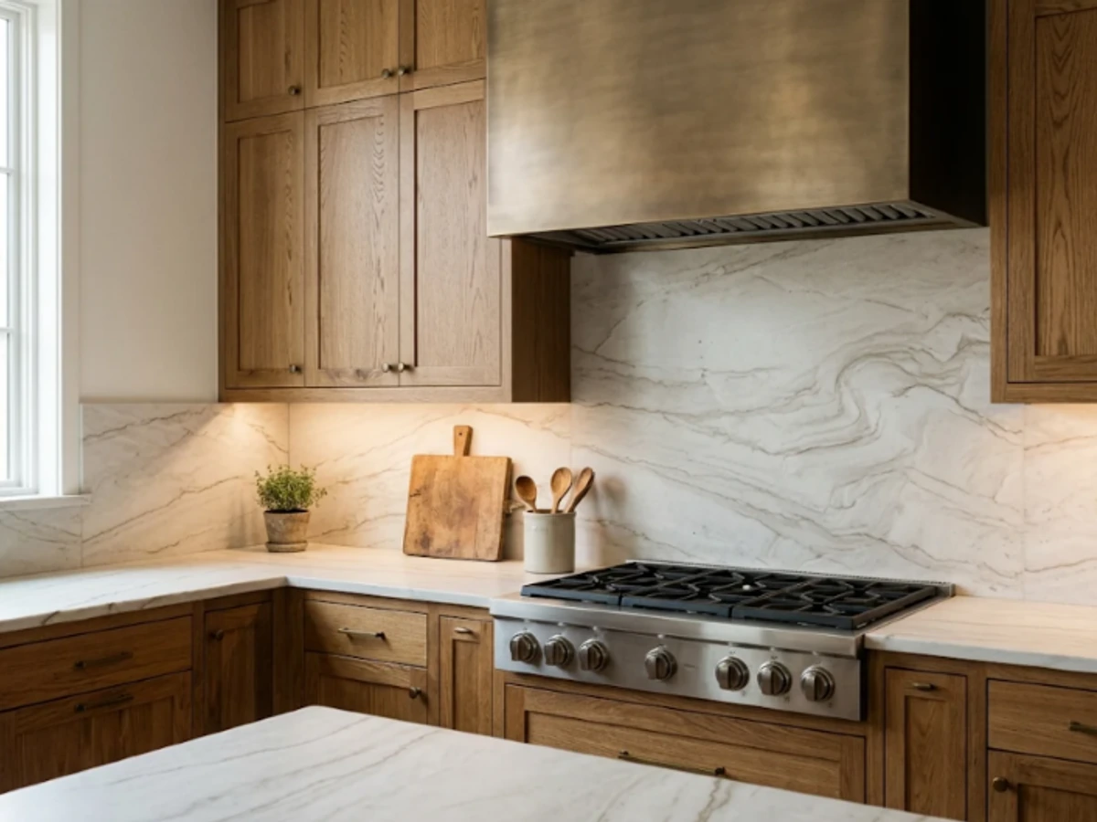
Idea 12: Honed Quartzite Backsplash — balancing tactile material texture and practical kitchen durability.
BEST FOR: Coordinating with natural wood and neutral cabinetry. PRO DESIGN TIP: Bring physical tile and grout samples home to inspect under morning and evening task lighting before ordering.
Countertop-Matched Engineered Quartz
Running the same engineered-quartz pattern from countertop onto backsplash creates a visually quiet, tailored finish. This is a strong choice for a kitchen with colorful cabinets or statement lighting because the surfaces read as one plane.
Confirm the manufacturer approves the product for vertical installation and the conditions behind your range. Engineered quartz has resin content, so heat-related clearances and appliance instructions matter; it should not be treated as interchangeable with natural stone.
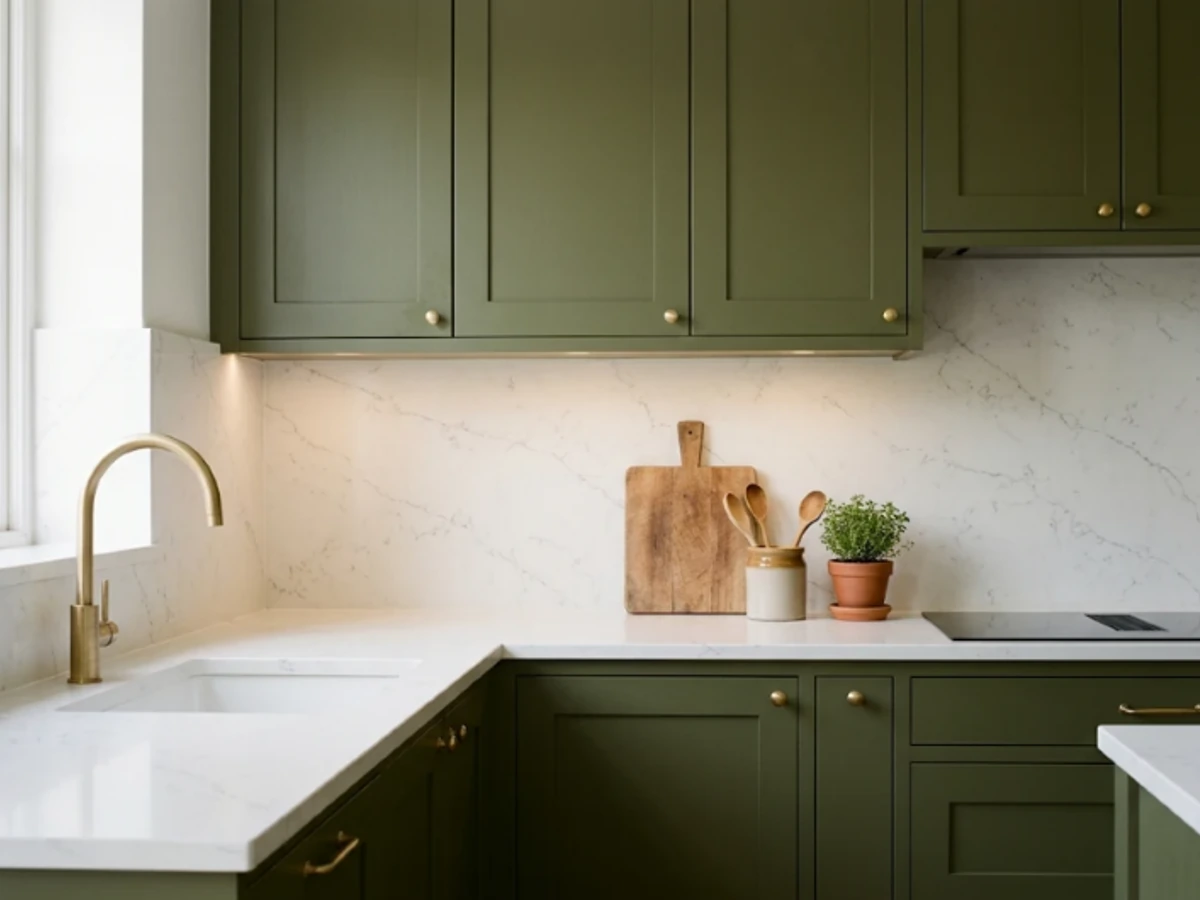
Idea 13: Countertop-Matched Engineered Quartz — balancing tactile material texture and practical kitchen durability.
BEST FOR: Coordinating with natural wood and neutral cabinetry. PRO DESIGN TIP: Bring physical tile and grout samples home to inspect under morning and evening task lighting before ordering.
Marble-Look Porcelain Slab
A porcelain slab with a marble-inspired print offers the drama of a large veined surface without the same maintenance profile as marble. It can make a compact kitchen feel more expansive because there are so few lines across the wall.
Evaluate printed vein quality and the layout of any seams, particularly at corners. Large slabs are not a beginner DIY material: specialist transport, cutting, edge detailing, and installation are often required.
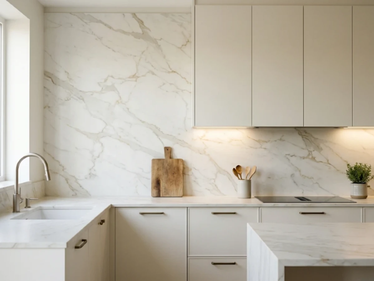
Idea 14: Marble-Look Porcelain Slab — balancing tactile material texture and practical kitchen durability.
BEST FOR: Coordinating with natural wood and neutral cabinetry. PRO DESIGN TIP: Bring physical tile and grout samples home to inspect under morning and evening task lighting before ordering.
Warm Travertine Tiles
Travertine brings honey, oatmeal, and cream tones that pair naturally with rustic oak, cream Shaker doors, and bronze fixtures. A honed square or rectangular format looks more contemporary than tiny distressed mosaics.
Stone is not maintenance-free: check whether the tiles are filled, what finish they have, and whether sealing is appropriate. A sample with actual grout helps reveal how much texture will remain once installed.
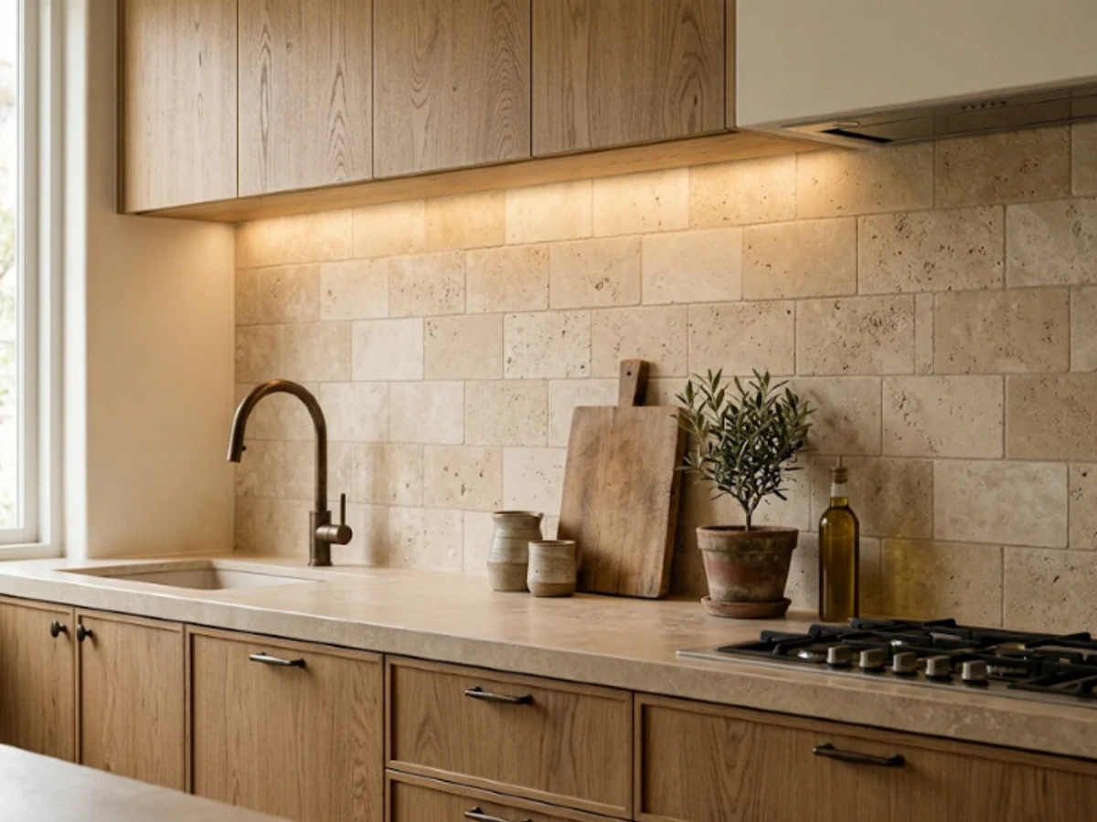
Idea 15: Warm Travertine Tiles — balancing tactile material texture and practical kitchen durability.
BEST FOR: Coordinating with natural wood and neutral cabinetry. PRO DESIGN TIP: Bring physical tile and grout samples home to inspect under morning and evening task lighting before ordering.
Tumbled Limestone Mosaic
For a relaxed country kitchen, limestone mosaics in pale ivory and oatmeal add soft edges and subtle tonal movement. Their compact pieces work particularly well inside a small range alcove or above a farmhouse sink.
The trade-off is grout: more small tiles mean more joints to maintain. Select a grout and stone treatment suitable for kitchen splashes, and keep harsh acidic cleaners away from limestone.
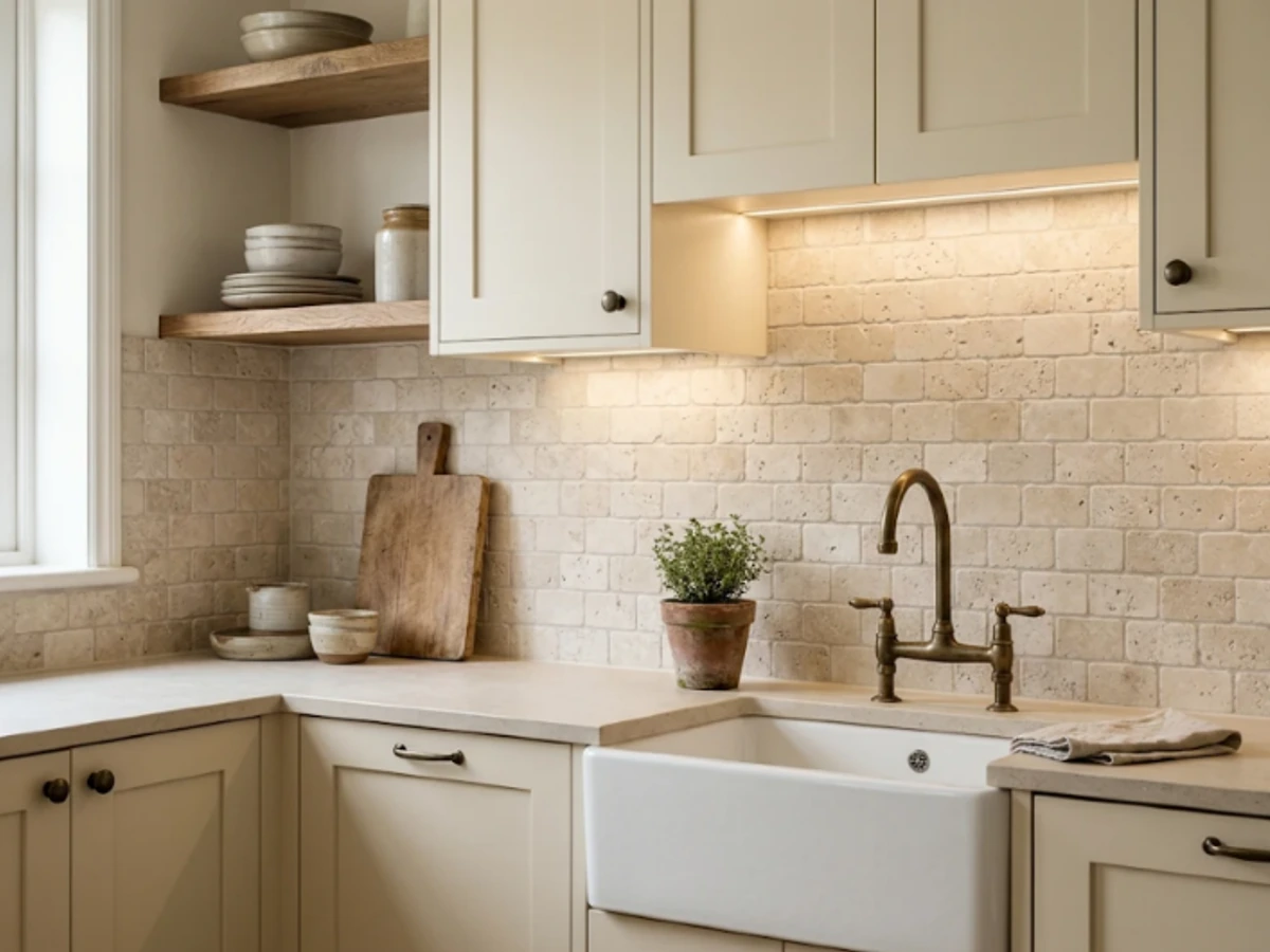
Idea 16: Tumbled Limestone Mosaic — balancing tactile material texture and practical kitchen durability.
BEST FOR: Coordinating with natural wood and neutral cabinetry. PRO DESIGN TIP: Bring physical tile and grout samples home to inspect under morning and evening task lighting before ordering.
Deep Charcoal Soapstone
Soapstone creates a moody counter-to-wall transition in a kitchen with cream or warm oak cabinetry. Its soft charcoal or near-black body adds an architectural quality that looks especially handsome beneath brass sconces.
Natural soapstone can mark or scratch, and some owners choose to darken its appearance with mineral oil. Discuss maintenance, fabrication thickness, and the final color with a qualified supplier rather than relying only on online pictures.
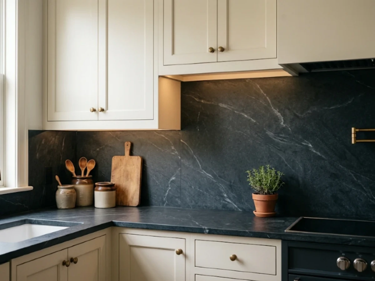
Idea 17: Deep Charcoal Soapstone — balancing tactile material texture and practical kitchen durability.
BEST FOR: Coordinating with natural wood and neutral cabinetry. PRO DESIGN TIP: Bring physical tile and grout samples home to inspect under morning and evening task lighting before ordering.
Terrazzo-Look Porcelain
Terrazzo-look porcelain brings lively little flecks to the kitchen without requiring a full statement pattern. Choose chips in cream, rust, olive, or charcoal to tie together multiple cabinet and countertop colors.
For a calm design, let the backsplash supply the flecks and keep the worktop relatively plain. Check the scale of the printed chips on a large sample; a pattern that looks delicate online may appear busy across an entire wall.
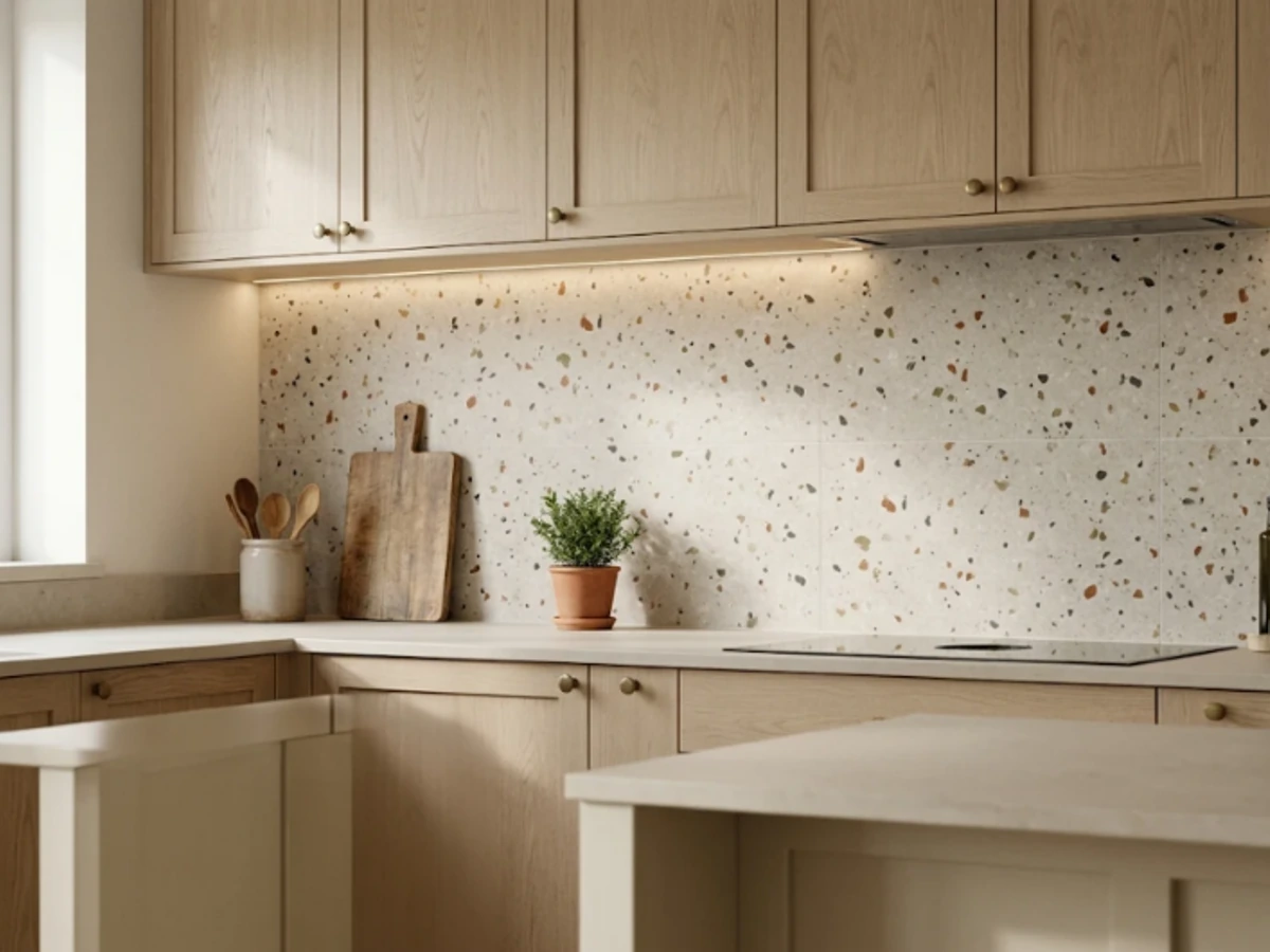
Idea 18: Terrazzo-Look Porcelain — balancing tactile material texture and practical kitchen durability.
BEST FOR: Coordinating with natural wood and neutral cabinetry. PRO DESIGN TIP: Bring physical tile and grout samples home to inspect under morning and evening task lighting before ordering.
Fluted Stone-Look Ceramic
Fluted tiles create shadow and depth with fine raised channels. In warm limestone-look ceramic, the texture suggests carved stone while keeping the color palette restrained. Use it where side lighting can reveal the relief.
Because grooves catch cooking residue, this is better suited to a low-splatter serving or beverage zone than a heavily used range wall. Ask for a cleanability demonstration and avoid assuming every ribbed product can handle the same conditions.
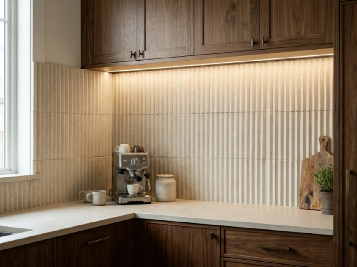
Idea 19: Fluted Stone-Look Ceramic — balancing tactile material texture and practical kitchen durability.
BEST FOR: Coordinating with natural wood and neutral cabinetry. PRO DESIGN TIP: Bring physical tile and grout samples home to inspect under morning and evening task lighting before ordering.
Stone Slab Behind the Range, Tile Elsewhere
You do not have to cover every wall in expensive stone. A single slab panel behind the cooktop can frame the cooking zone, while coordinated ceramic tile runs along the prep and sink counters.
The key is disciplined material matching: repeat one warm undertone and align the height where the materials meet. Have the fabricator and tile installer agree on trim, expansion joints, clearances, and transitions before ordering either material.
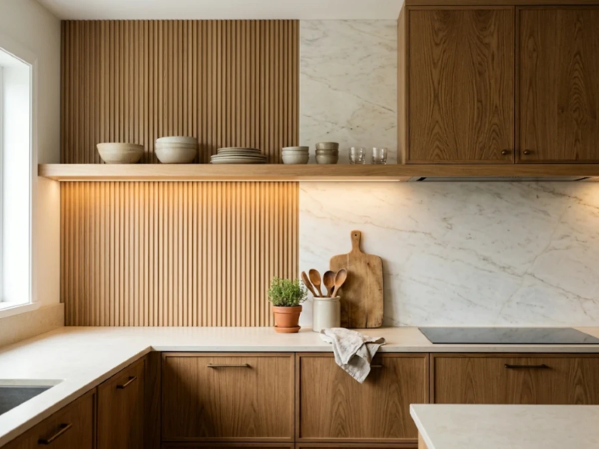
Idea 20: Stone Slab Behind the Range, Tile Elsewhere — balancing tactile material texture and practical kitchen durability.
BEST FOR: Coordinating with natural wood and neutral cabinetry. PRO DESIGN TIP: Bring physical tile and grout samples home to inspect under morning and evening task lighting before ordering.
Sage Green Handmade Tile
Sage green is gentle enough to function almost like a neutral, especially with white oak, warm white cabinets, and pale counters. Handmade-look glaze adds depth as different tiles catch light and appear slightly lighter or darker.
Keep the grout close to the tile color if you want a relaxed result. Choose one small accent color in nearby accessories rather than adding several competing greens.
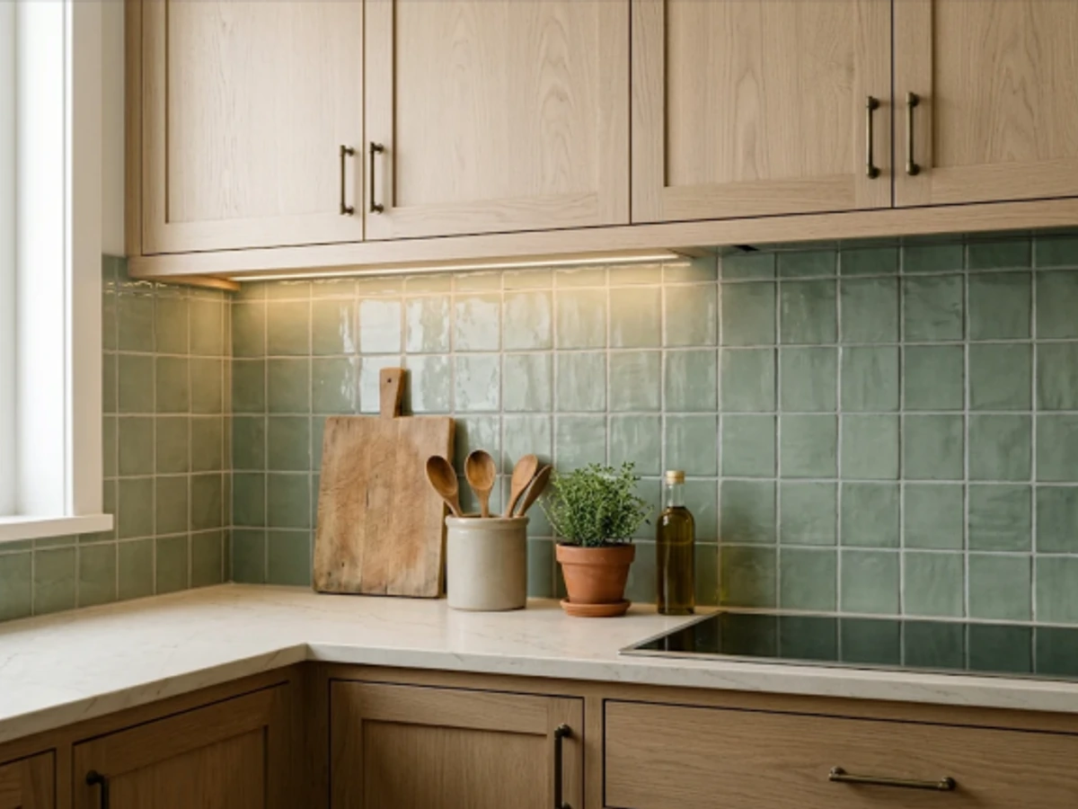
Idea 21: Sage Green Handmade Tile — balancing tactile material texture and practical kitchen durability.
BEST FOR: Coordinating with natural wood and neutral cabinetry. PRO DESIGN TIP: Bring physical tile and grout samples home to inspect under morning and evening task lighting before ordering.
Olive Green Vertical Stack
An olive backsplash introduces richness without the brightness of emerald. Long vertical rectangles emphasize height and complement walnut, dark bronze, and warm beige countertops.
This palette can feel heavy in a kitchen with little daylight, so test it under your actual under-cabinet lights. Pair deeper tile with lighter upper cabinetry or a bright plaster hood to balance the room.
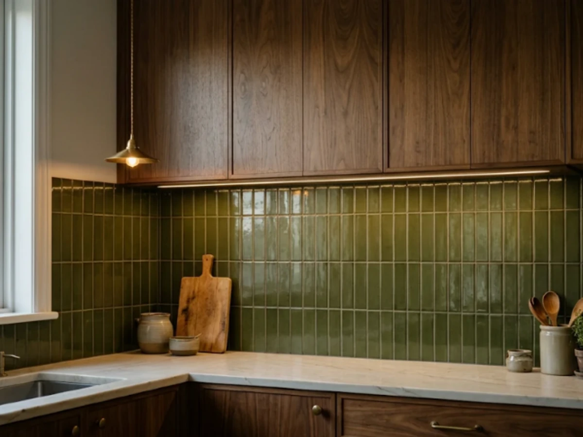
Idea 22: Olive Green Vertical Stack — balancing tactile material texture and practical kitchen durability.
BEST FOR: Coordinating with natural wood and neutral cabinetry. PRO DESIGN TIP: Bring physical tile and grout samples home to inspect under morning and evening task lighting before ordering.
Forest Green Gloss Tile
Forest green tile makes a memorable backsplash when the surrounding cabinets are soft white or natural wood. A deep, reflective glaze can create a jewel-box quality beneath warm under-cabinet lighting.
Keep hardware simple and use a relatively quiet countertop. If you are unsure about using the color everywhere, concentrate it on a smaller range wall or a separate beverage area.
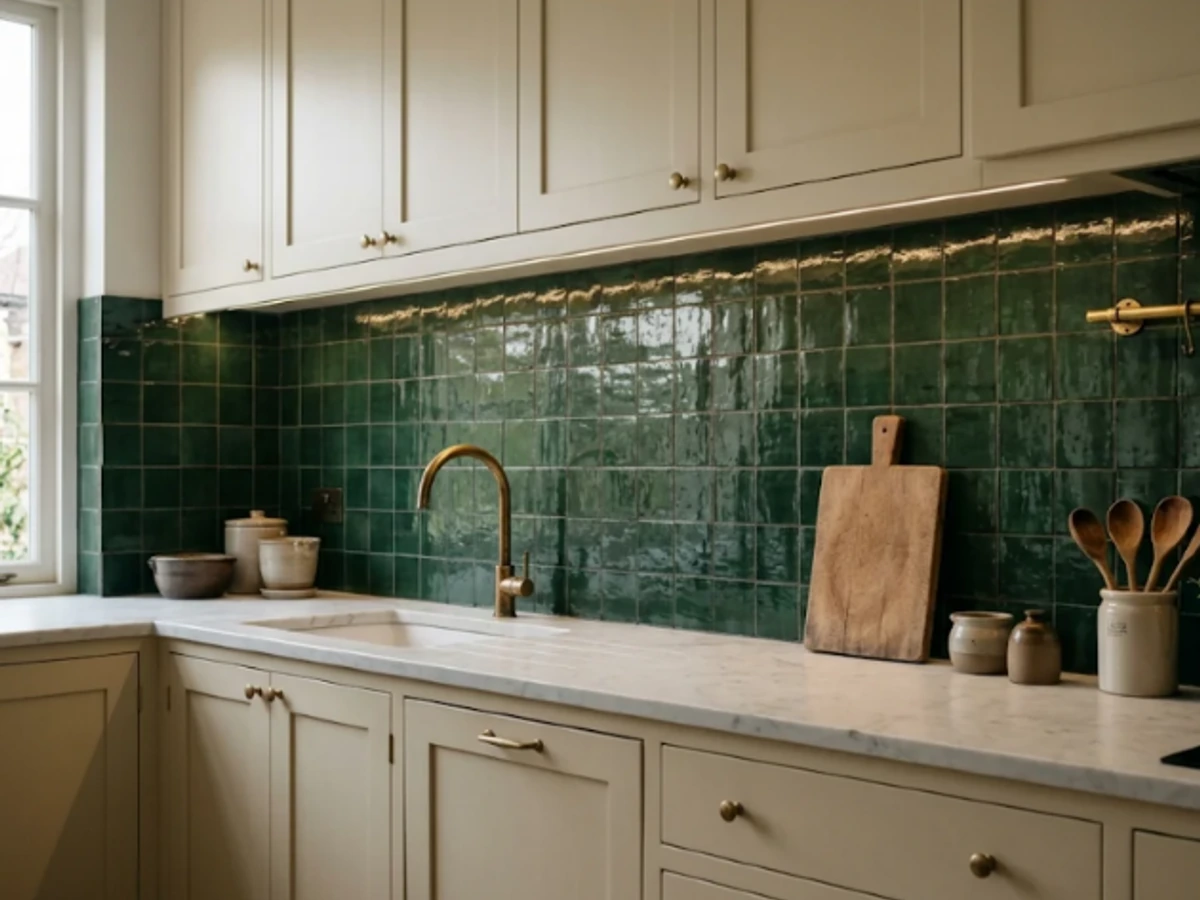
Idea 23: Forest Green Gloss Tile — balancing tactile material texture and practical kitchen durability.
BEST FOR: Coordinating with natural wood and neutral cabinetry. PRO DESIGN TIP: Bring physical tile and grout samples home to inspect under morning and evening task lighting before ordering.
Dusty Blue Subway Tile
Dusty blue softens a traditional subway layout and works beautifully with brushed nickel, white shaker cabinets, and weathered oak flooring. It creates a cool accent without making the whole kitchen feel icy.
Choose a blue with a muted gray undertone for a relaxed look; a clear sky blue produces a more cheerful, coastal effect. Check the shade against the countertop in both daylight and artificial light.
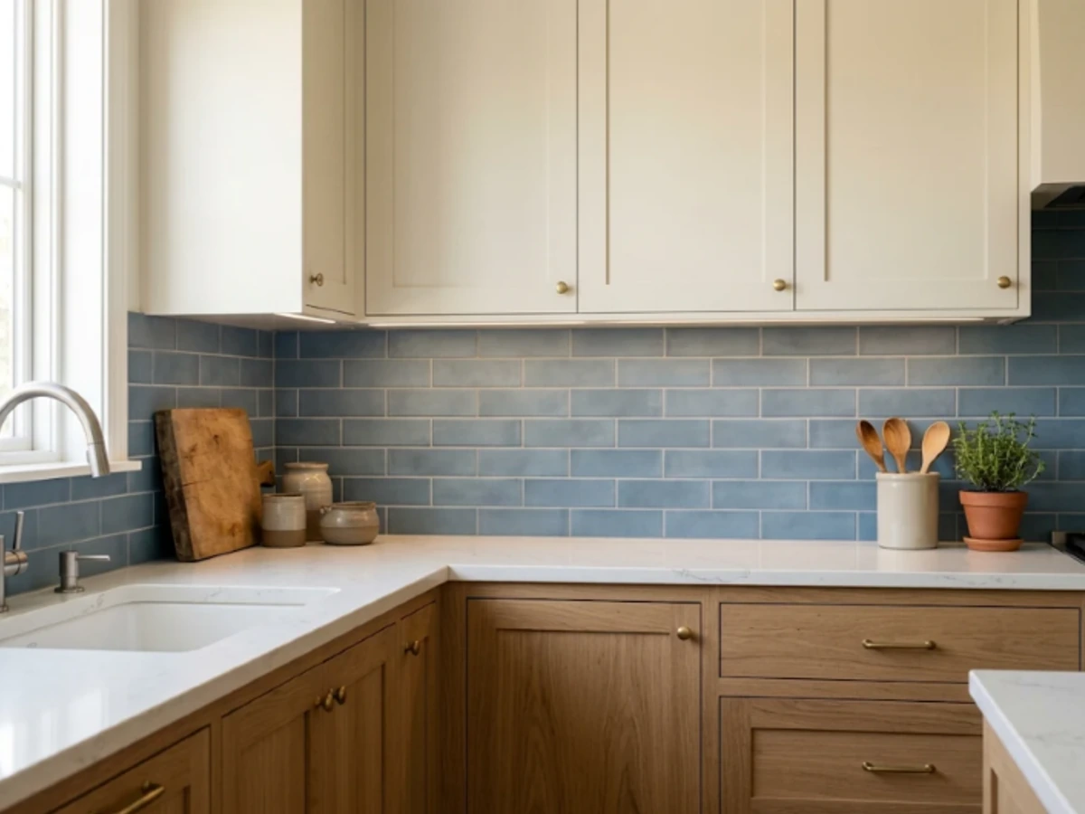
Idea 24: Dusty Blue Subway Tile — balancing tactile material texture and practical kitchen durability.
BEST FOR: Coordinating with natural wood and neutral cabinetry. PRO DESIGN TIP: Bring physical tile and grout samples home to inspect under morning and evening task lighting before ordering.
Navy Hexagon Tile
Navy hexagon tile is a strong option for a compact feature backsplash because the shape adds interest even when the color is solid. It can look crisp with white cabinetry or dramatic alongside walnut.
A navy-and-white contrast becomes graphic quickly; matching navy grout keeps the effect more continuous. Use a full-size paper or digital layout to check how hexagons terminate at the counter, cabinets, and windows.
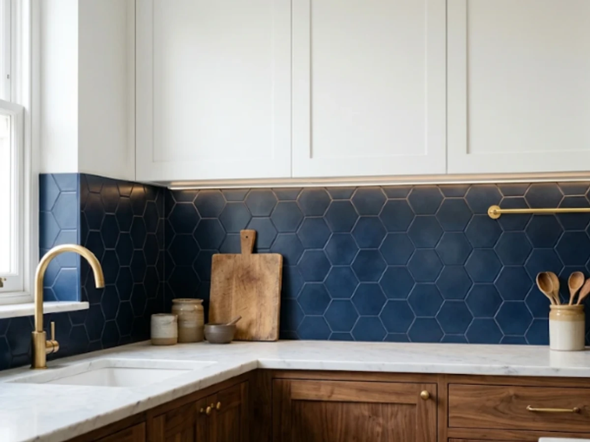
Idea 25: Navy Hexagon Tile — balancing tactile material texture and practical kitchen durability.
BEST FOR: Coordinating with natural wood and neutral cabinetry. PRO DESIGN TIP: Bring physical tile and grout samples home to inspect under morning and evening task lighting before ordering.
Powder Blue Fish-Scale Tile
Fish-scale or scalloped tiles bring a playful curve to a kitchen with simple cabinet fronts. In powder blue, the shape suggests water and fits light-filled coastal or cottage-style rooms without needing obvious beach decorations.
Pay particular attention to the orientation and finished top edge: scallop tiles can look very different depending on which direction they point. Request the installer’s layout drawing before work begins.
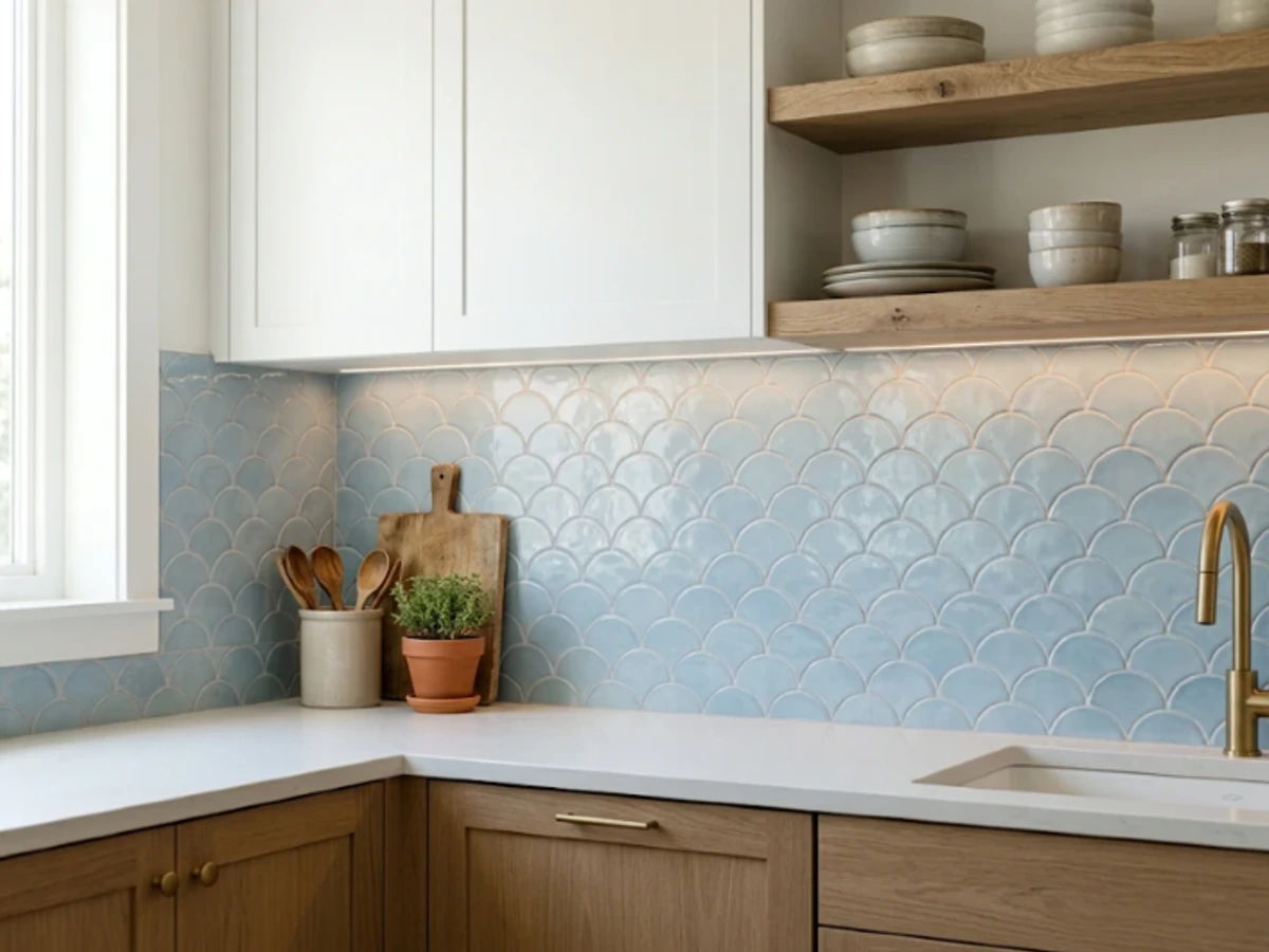
Idea 26: Powder Blue Fish-Scale Tile — balancing tactile material texture and practical kitchen durability.
BEST FOR: Coordinating with natural wood and neutral cabinetry. PRO DESIGN TIP: Bring physical tile and grout samples home to inspect under morning and evening task lighting before ordering.
Burgundy Glazed Square Tile
Burgundy, oxblood, or deep wine tile makes an intimate focal wall in a kitchen furnished with cream, walnut, and warm brass. The rich tone feels particularly effective with simple square shapes rather than elaborate patterns.
Gloss brings out tonal variation, while matte creates a quieter, more velvety look. Try the tile next to cabinet paint before committing: red undertones can shift dramatically beside orange-toned wood.
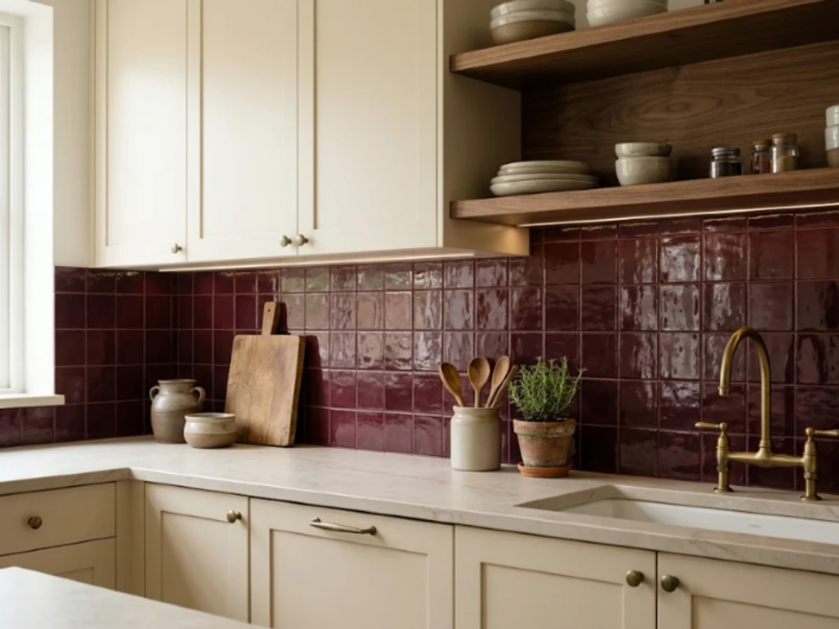
Idea 27: Burgundy Glazed Square Tile — balancing tactile material texture and practical kitchen durability.
BEST FOR: Coordinating with natural wood and neutral cabinetry. PRO DESIGN TIP: Bring physical tile and grout samples home to inspect under morning and evening task lighting before ordering.
Terracotta Square Tile
Clay-colored tile adds an earthy warmth to green cabinets, natural wood, or creamy plaster walls. A simple square layout feels relaxed and Mediterranean, particularly when mixed with woven textures and copper accessories.
For real terracotta, confirm suitability for kitchen splashes, surface sealing, and cleaning; glazed ceramic in a terracotta color may be easier to maintain. The same visual effect can be achieved with different material responsibilities.
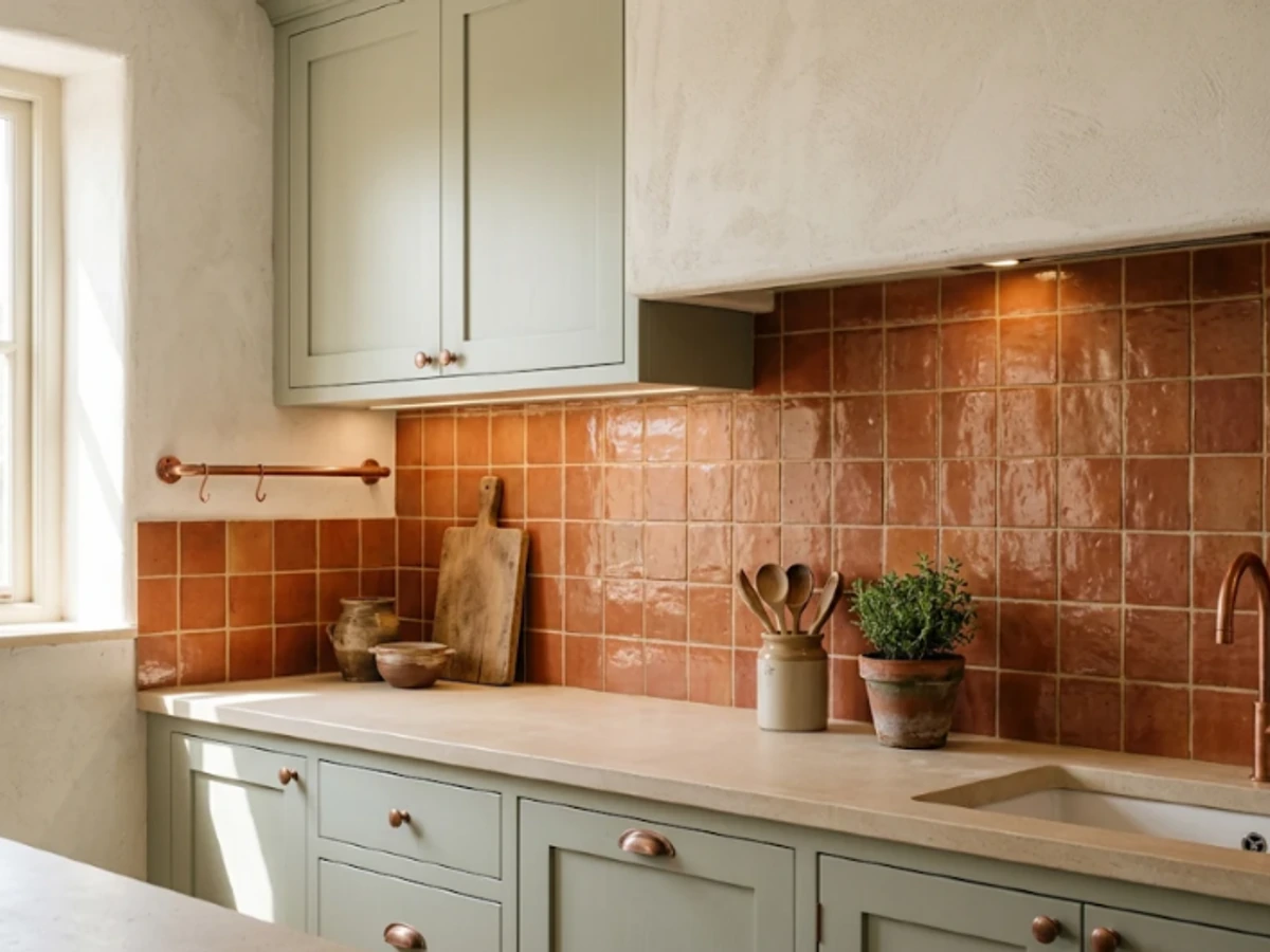
Idea 28: Terracotta Square Tile — balancing tactile material texture and practical kitchen durability.
BEST FOR: Coordinating with natural wood and neutral cabinetry. PRO DESIGN TIP: Bring physical tile and grout samples home to inspect under morning and evening task lighting before ordering.
Butter Yellow Tile
Soft butter yellow brings warmth to a north-facing kitchen and pairs nicely with cream cabinets and light wood. The key is choosing a mellow shade that feels sunny rather than neon.
Use simple square or rectangular tile and let the color do the work. A white countertop keeps the composition bright; a warm stone or butcher-block accent gives it a more nostalgic look.
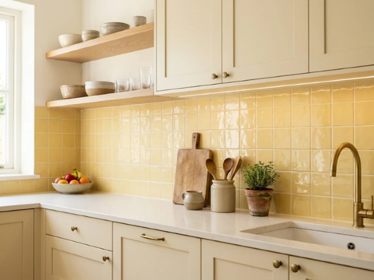
Idea 29: Butter Yellow Tile — balancing tactile material texture and practical kitchen durability.
BEST FOR: Coordinating with natural wood and neutral cabinetry. PRO DESIGN TIP: Bring physical tile and grout samples home to inspect under morning and evening task lighting before ordering.
Blush Pink Finger Tile
Blush pink finger tiles introduce color and delicate vertical lines into a modern kitchen. The combination works with walnut, warm white, and matte black details, depending on how bold you want the finish.
Because both the format and hue make a statement, keep the surrounding styling spare. Choose a grout that supports rather than outlines every strip, especially in a narrow kitchenette.
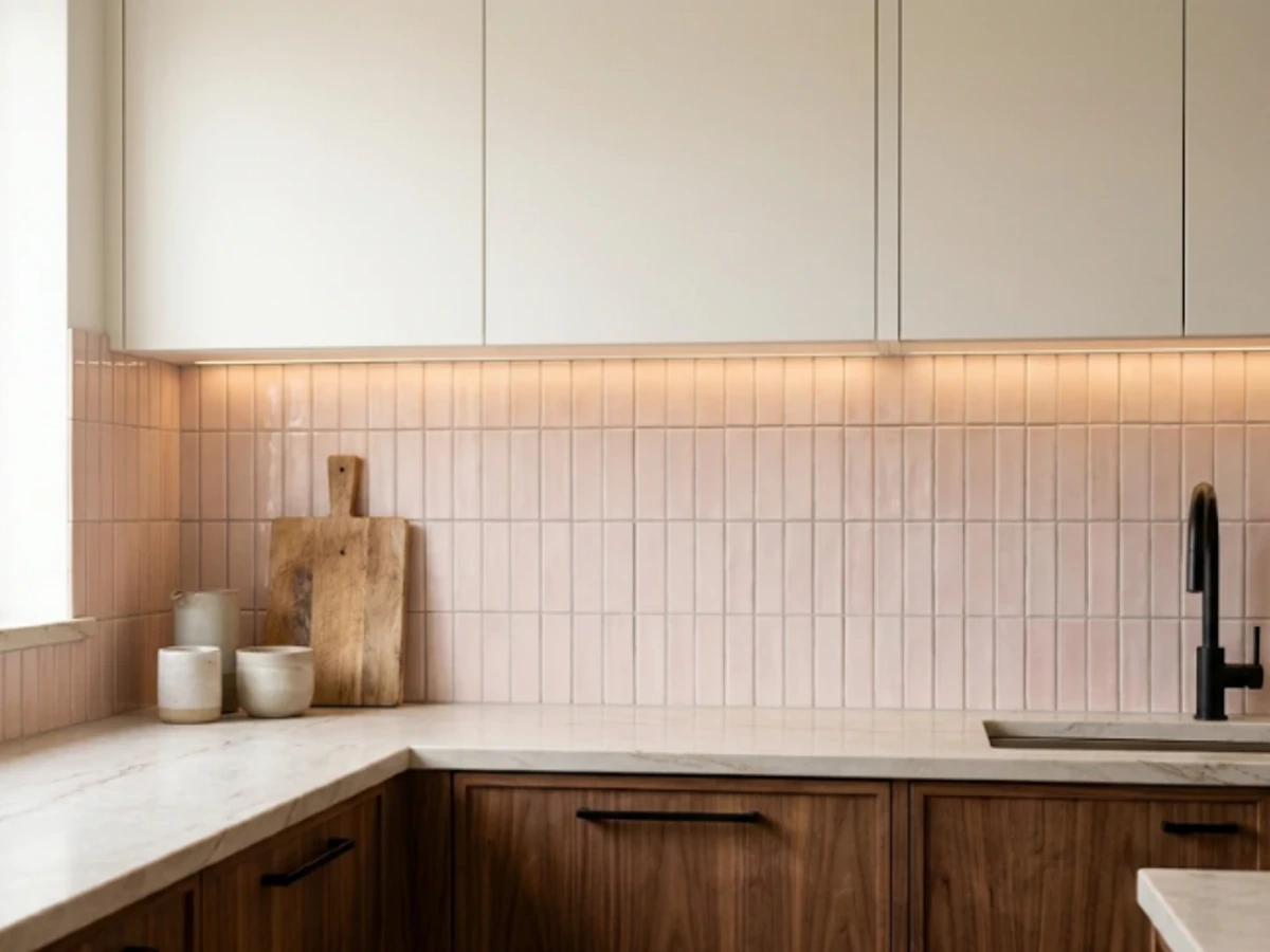
Idea 30: Blush Pink Finger Tile — balancing tactile material texture and practical kitchen durability.
BEST FOR: Coordinating with natural wood and neutral cabinetry. PRO DESIGN TIP: Bring physical tile and grout samples home to inspect under morning and evening task lighting before ordering.
Vertical White Subway Tile
The same white rectangle used in a traditional horizontal subway backsplash feels fresh when installed vertically. The repeated upright joints can visually lengthen the wall behind a prep counter or a petite apartment kitchen.
A vertically stacked layout looks especially clean with flat-front cabinetry. Center the columns around the focal area so a thin sliver of tile does not become the first thing you notice.
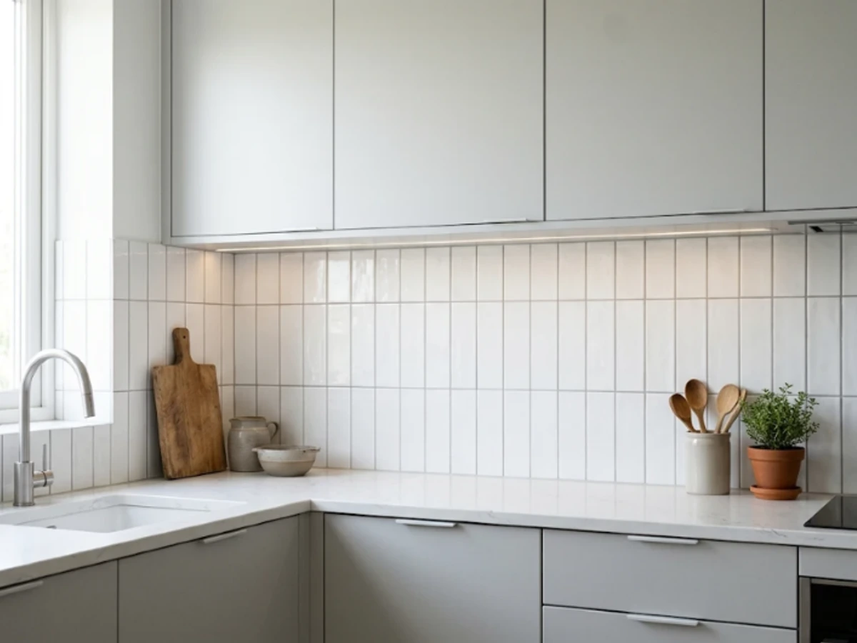
Idea 31: Vertical White Subway Tile — balancing tactile material texture and practical kitchen durability.
BEST FOR: Coordinating with natural wood and neutral cabinetry. PRO DESIGN TIP: Bring physical tile and grout samples home to inspect under morning and evening task lighting before ordering.
Sage Herringbone Pattern
Herringbone becomes more expressive when made from soft green rectangular tiles. The angled lines bring movement to a plain kitchen, while muted color keeps the backsplash from feeling hectic.
Use a precise centerline behind the range, and request a quote that includes the extra cutting and waste. A herringbone installation is not just a different tile orientation; it needs thoughtful planning at every edge.
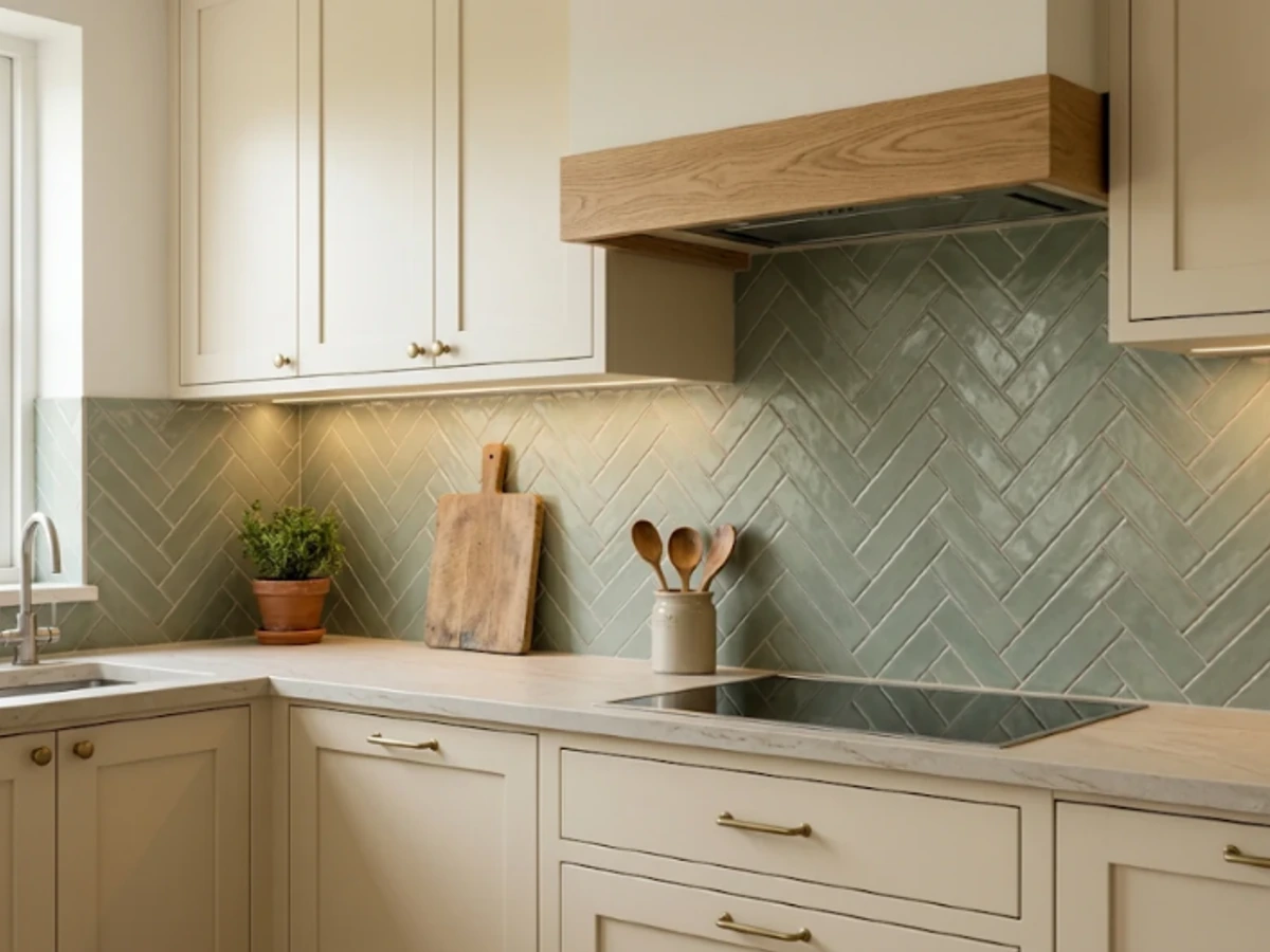
Idea 32: Sage Herringbone Pattern — balancing tactile material texture and practical kitchen durability.
BEST FOR: Coordinating with natural wood and neutral cabinetry. PRO DESIGN TIP: Bring physical tile and grout samples home to inspect under morning and evening task lighting before ordering.
Porcelain Basketweave Mosaic
Basketweave mosaics borrow a classic pattern from traditional floors and reinterpret it as a neat kitchen detail. In porcelain, a soft white-and-gray version works with timeless cabinets and polished nickel handles.
Use it over a contained area, such as a range wall, if you have heavily veined countertops. Check grout color carefully because the many joints determine whether the basketweave reads as delicate or graphic.
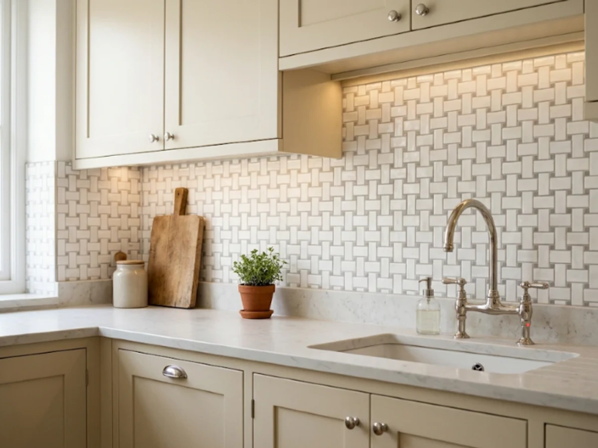
Idea 33: Porcelain Basketweave Mosaic — balancing tactile material texture and practical kitchen durability.
BEST FOR: Coordinating with natural wood and neutral cabinetry. PRO DESIGN TIP: Bring physical tile and grout samples home to inspect under morning and evening task lighting before ordering.
Scalloped White Ceramic
Curved white scallop tiles bring character without relying on color. They can soften a kitchen full of straight cabinet edges and rectangular appliances, making them ideal for a light cottage or transitional space.
The installation needs a considered finish along the top and sides. Pair with simple hardware and keep accessories to a minimum so the curved profile remains the hero.
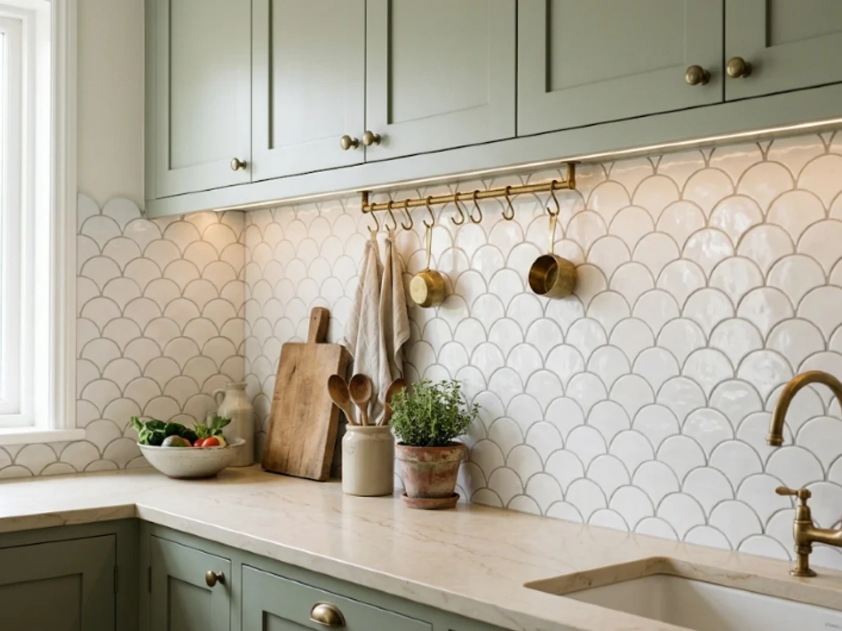
Idea 34: Scalloped White Ceramic — balancing tactile material texture and practical kitchen durability.
BEST FOR: Coordinating with natural wood and neutral cabinetry. PRO DESIGN TIP: Bring physical tile and grout samples home to inspect under morning and evening task lighting before ordering.
Warm Gray Hexagon Tile
Hexagons bridge classic and modern design. A warm gray ceramic hexagon makes a subtle pattern behind cream or oak cabinets without the harsher contrast of black-and-white graphics.
Pick a size that fits your backsplash height. Very small hexagons can feel busy across a long wall, while medium tiles make the geometry easier to appreciate. Ask how the installer will handle edge cuts.
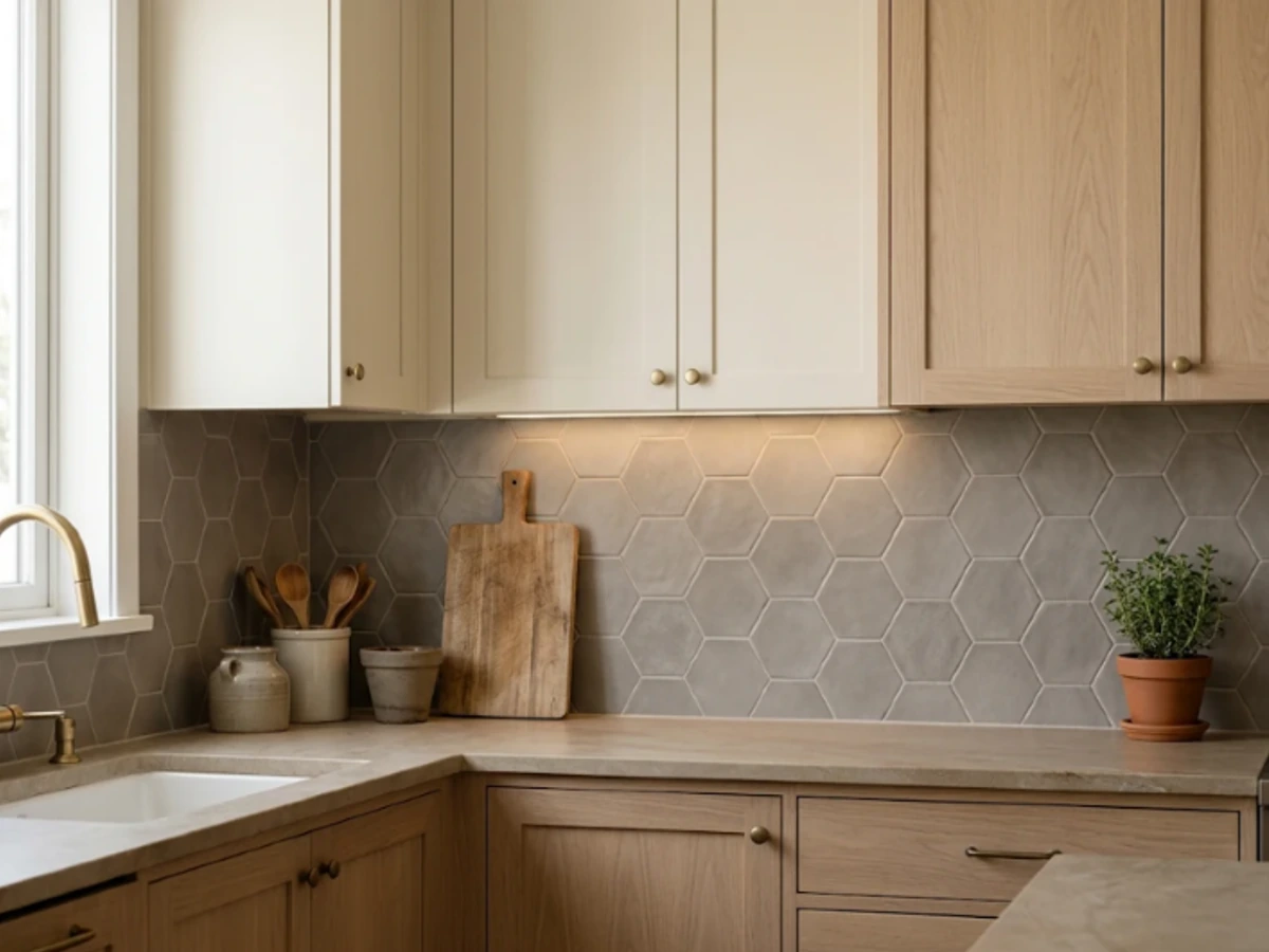
Idea 35: Warm Gray Hexagon Tile — balancing tactile material texture and practical kitchen durability.
BEST FOR: Coordinating with natural wood and neutral cabinetry. PRO DESIGN TIP: Bring physical tile and grout samples home to inspect under morning and evening task lighting before ordering.
Star-and-Cross Tile
Star-and-cross tile introduces a historic, artisanal silhouette that fits Mediterranean and Spanish-inspired kitchens. Cream or sandy tile feels subtle; mixed warm hues create a more collected, old-world look.
Because the shapes interlock, accurate installation matters. Lay out a sample panel to confirm spacing and repeat, and keep the countertop pattern simple so the backsplash remains readable.
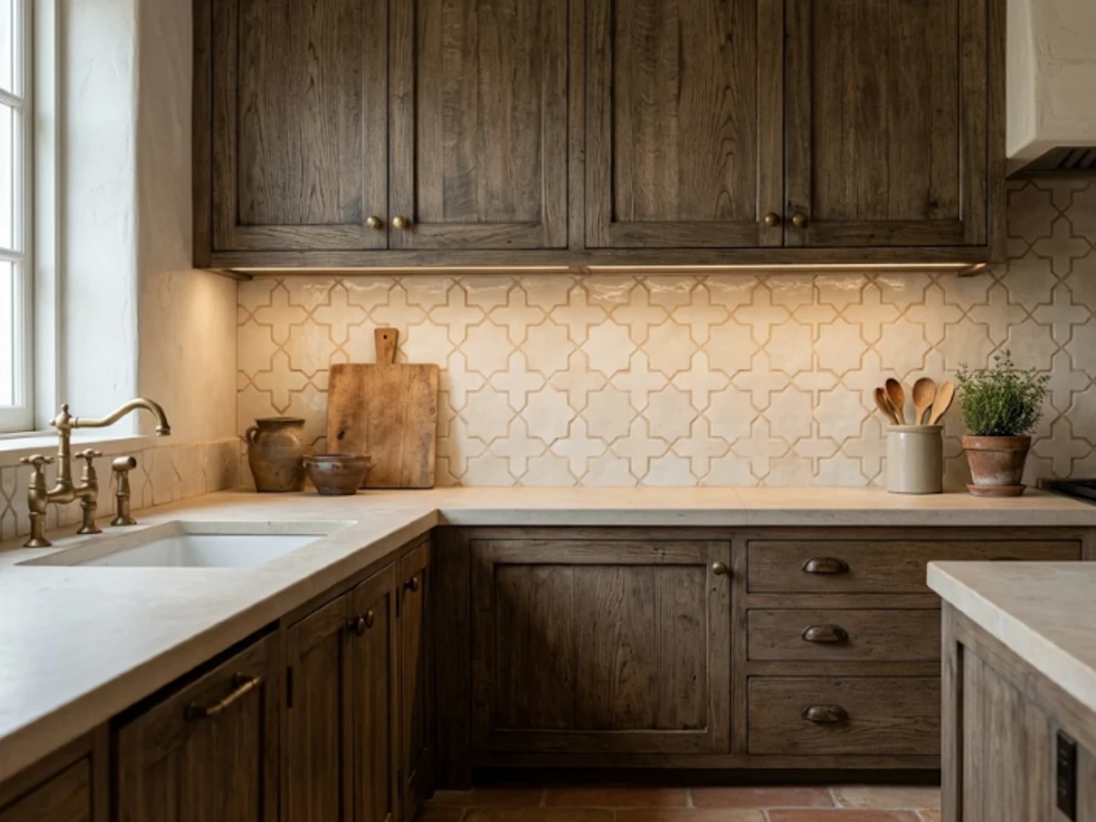
Idea 36: Star-and-Cross Tile — balancing tactile material texture and practical kitchen durability.
BEST FOR: Coordinating with natural wood and neutral cabinetry. PRO DESIGN TIP: Bring physical tile and grout samples home to inspect under morning and evening task lighting before ordering.
Encaustic-Look Porcelain Pattern
For a patterned focal point without using genuine encaustic cement tile, choose a porcelain tile printed with a classic repeating motif. Muted blue, oatmeal, and cream work especially well with simple white cabinets.
The surface is comparatively convenient to maintain, but the pattern needs careful centering. Use it behind the stove or in a compact pantry so it does not overwhelm surrounding details.
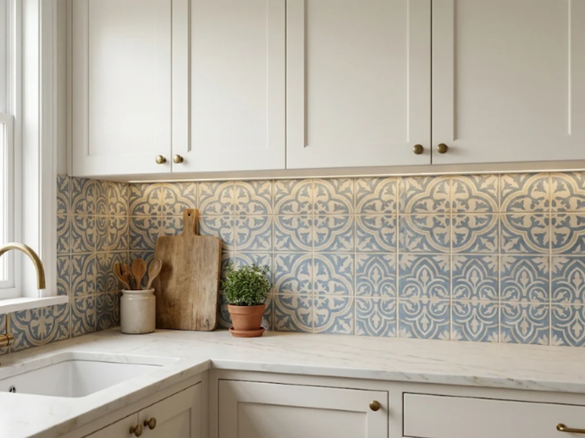
Idea 37: Encaustic-Look Porcelain Pattern — balancing tactile material texture and practical kitchen durability.
BEST FOR: Coordinating with natural wood and neutral cabinetry. PRO DESIGN TIP: Bring physical tile and grout samples home to inspect under morning and evening task lighting before ordering.
Midcentury Triangle Tile
Triangular tiles in cream, camel, and charcoal bring a lively midcentury mood to a breakfast bar or open kitchen. A restrained three-color scheme gives the geometry intention rather than visual noise.
Plan the pattern on paper before tiling. The most successful version uses a repeating rhythm and leaves cabinets, worktops, and hardware simpler than the tile itself.
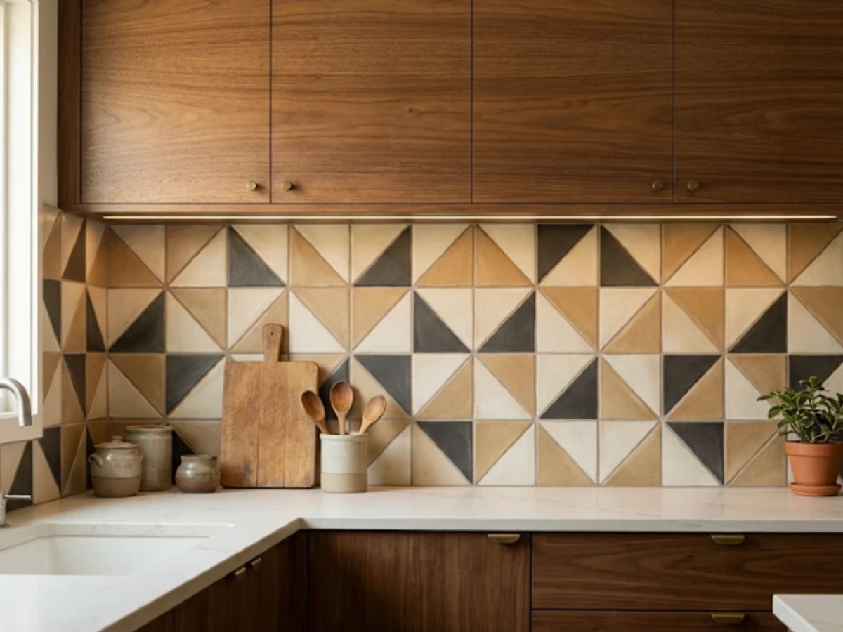
Idea 38: Midcentury Triangle Tile — balancing tactile material texture and practical kitchen durability.
BEST FOR: Coordinating with natural wood and neutral cabinetry. PRO DESIGN TIP: Bring physical tile and grout samples home to inspect under morning and evening task lighting before ordering.
Picture-Framed Mosaic Behind the Range
A framed insert offers a way to introduce a decorative mosaic without tiling the entire kitchen in it. A rectangular centerpiece behind the range can be bordered by calmer field tile, like a piece of built-in artwork.
Keep the insert proportional to the range and hood width. Avoid creating a recessed ledge where grease can accumulate, and have the installer plan the surrounding joints before the first tile goes up.
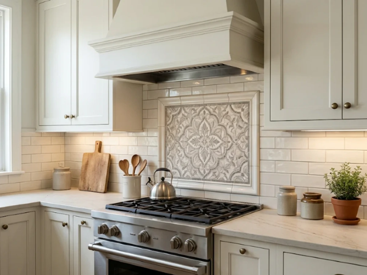
Idea 39: Picture-Framed Mosaic Behind the Range — balancing tactile material texture and practical kitchen durability.
BEST FOR: Coordinating with natural wood and neutral cabinetry. PRO DESIGN TIP: Bring physical tile and grout samples home to inspect under morning and evening task lighting before ordering.
Taupe Chevron Tile
Chevron tile forms continuous V-shaped lines that feel sharper than herringbone. In taupe or mushroom gray, it adds understated movement to a calm kitchen with stone countertops and oak cabinetry.
Precision is important because slight alignment errors become visible across the diagonal lines. Compare actual pre-cut chevron tile with ordinary rectangles before ordering; the cutting and labor needs can be quite different.
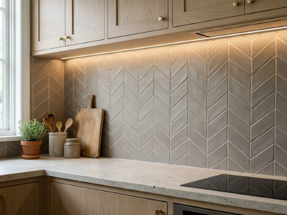
Idea 40: Taupe Chevron Tile — balancing tactile material texture and practical kitchen durability.
BEST FOR: Coordinating with natural wood and neutral cabinetry. PRO DESIGN TIP: Bring physical tile and grout samples home to inspect under morning and evening task lighting before ordering.
Removable Peel-and-Stick Tile
Peel-and-stick backsplash panels can update a rental or a kitchen that is not ready for a full remodel. Choose a restrained white subway or handmade-look print if you want to keep the result versatile.
Read the exact product instructions before buying. Adhesion depends on wall preparation, and some products are not permitted near heat or direct water. Never assume a vinyl panel is suitable behind a gas range simply because it is marketed for kitchens.
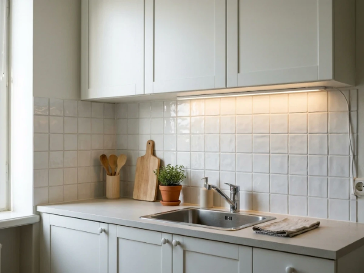
Idea 41: Removable Peel-and-Stick Tile — balancing tactile material texture and practical kitchen durability.
BEST FOR: Coordinating with natural wood and neutral cabinetry. PRO DESIGN TIP: Bring physical tile and grout samples home to inspect under morning and evening task lighting before ordering.
Painted Moisture-Resistant Beadboard
Beadboard can give a breakfast alcove or low-splash kitchen wall a cottage feel without using ceramic tile. Paint it a soft cream or sage and repeat the same color on nearby trim for a built-in look.
It is not automatically appropriate behind a sink or range. Use a specified moisture-resistant system and suitable protective finish where allowed, keep seams well detailed, and choose a different noncombustible backsplash where your appliance requires one.
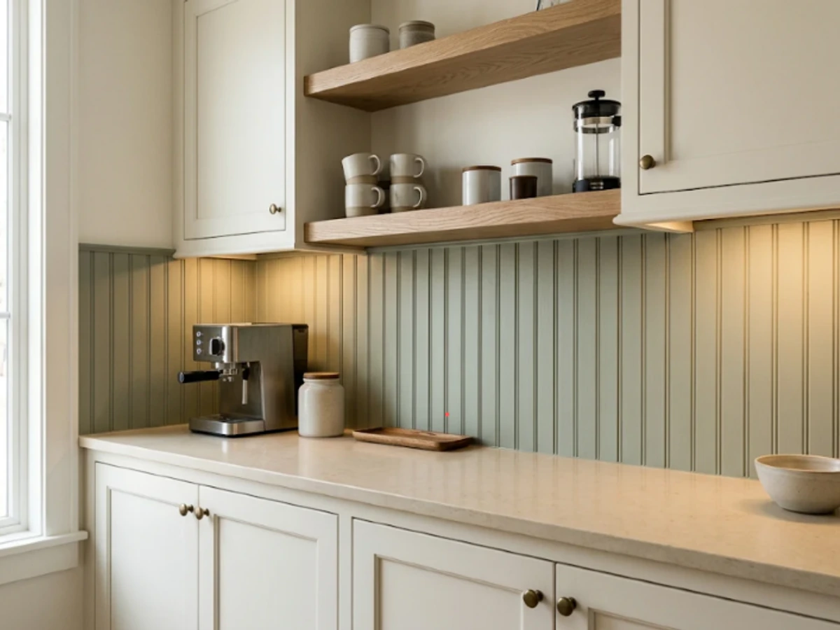
Idea 42: Painted Moisture-Resistant Beadboard — balancing tactile material texture and practical kitchen durability.
BEST FOR: Coordinating with natural wood and neutral cabinetry. PRO DESIGN TIP: Bring physical tile and grout samples home to inspect under morning and evening task lighting before ordering.
Stainless-Steel Range Panel
A stainless-steel panel behind the range creates a professional-kitchen accent and can be practical where splashes are frequent. It looks deliberate alongside an industrial hood, wood cabinets, and matte black fixtures.
Choose a finish that you are comfortable wiping often: fingerprints and fine scratches may show. Verify the panel material, edge details, attachment method, and heat clearances with the fabricator and appliance manufacturer.
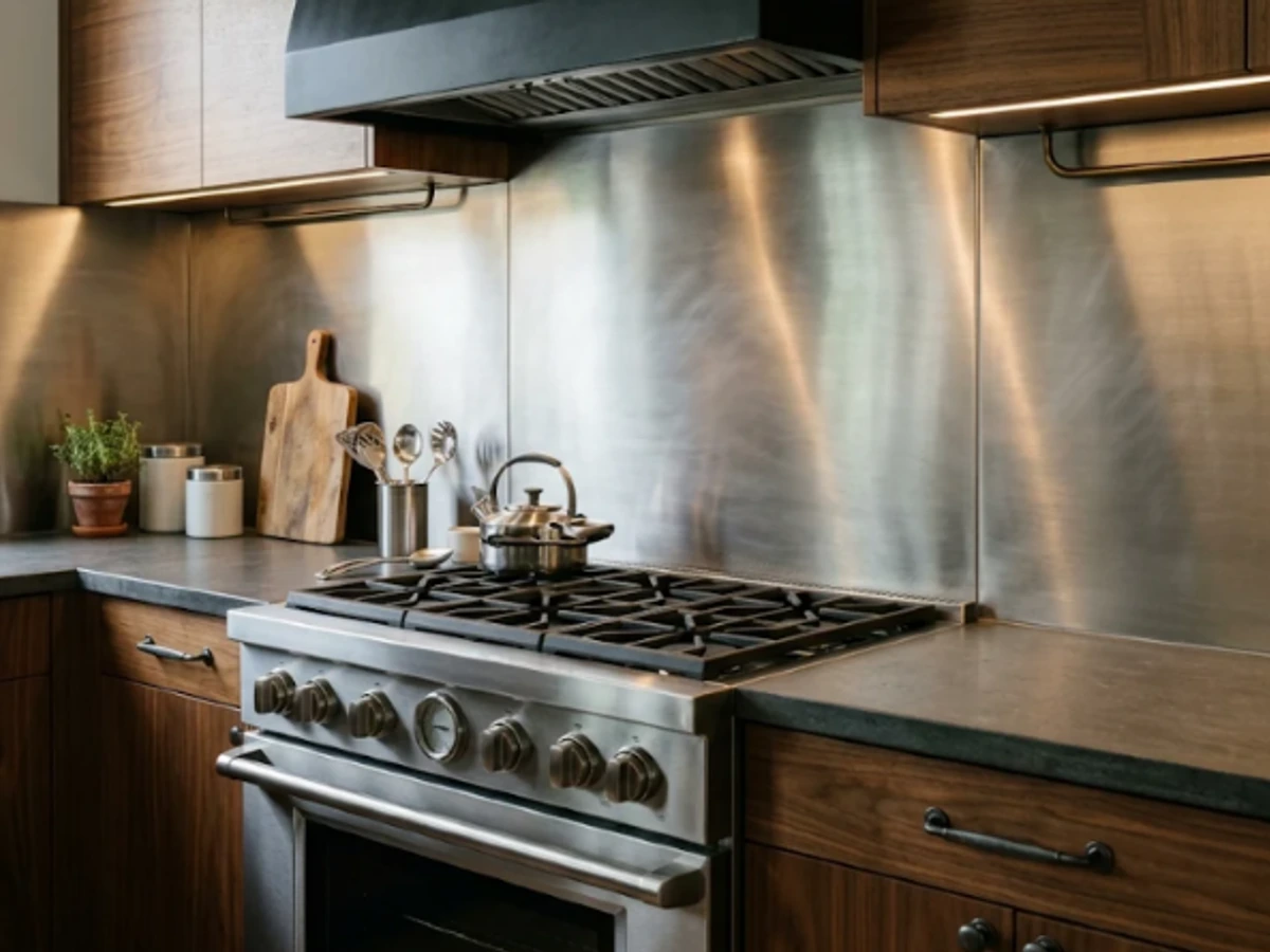
Idea 43: Stainless-Steel Range Panel — balancing tactile material texture and practical kitchen durability.
BEST FOR: Coordinating with natural wood and neutral cabinetry. PRO DESIGN TIP: Bring physical tile and grout samples home to inspect under morning and evening task lighting before ordering.
Back-Painted Glass Panel
A back-painted glass backsplash provides a continuous, reflective surface with very few grout lines. In pale gray, warm white, or sage, it can make a narrow kitchen feel neat and brighter.
Use a fabricator who specifies the correct glass type and mounting system for the location. Glass next to a cooking appliance may need special heat-resistant specifications; do not substitute ordinary decorative glass without checking.
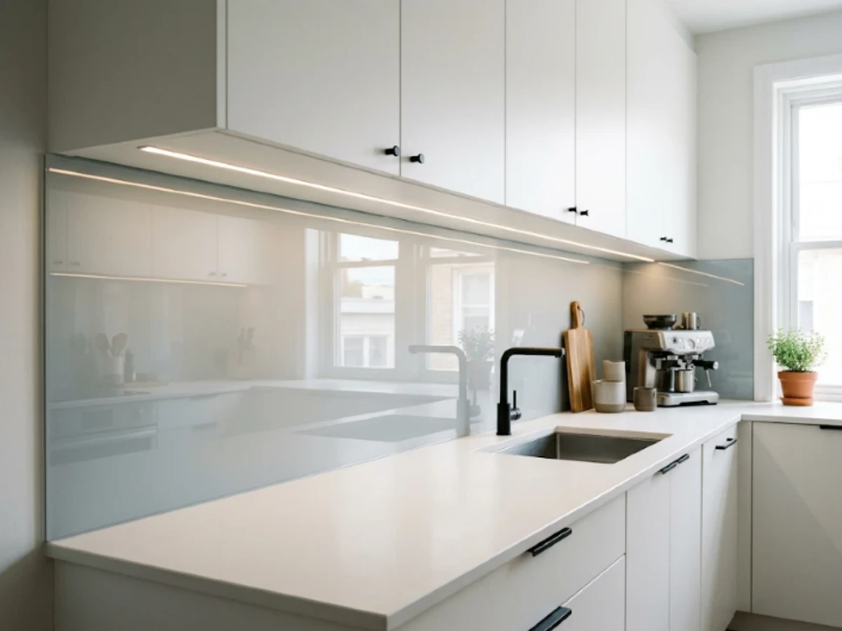
Idea 44: Back-Painted Glass Panel — balancing tactile material texture and practical kitchen durability.
BEST FOR: Coordinating with natural wood and neutral cabinetry. PRO DESIGN TIP: Bring physical tile and grout samples home to inspect under morning and evening task lighting before ordering.
Pressed-Metal Tin-Look Panels
Pressed-metal-look panels lend a vintage café or farmhouse touch to a kitchen with dark green cabinetry and warm wood. Choose a restrained repeating motif rather than mixing several ornamental patterns.
Materials vary widely, from actual metal to lightweight decorative panels. Check compatibility with cooking heat, moisture, cleaning products, and local requirements. Avoid untreated seams where grease and water could collect.
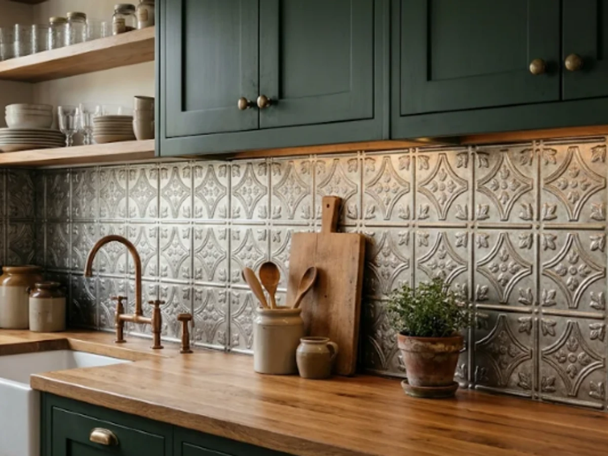
Idea 45: Pressed-Metal Tin-Look Panels — balancing tactile material texture and practical kitchen durability.
BEST FOR: Coordinating with natural wood and neutral cabinetry. PRO DESIGN TIP: Bring physical tile and grout samples home to inspect under morning and evening task lighting before ordering.
Sealed Brick Veneer
Thin brick veneer can make a kitchen feel inviting and lived-in, particularly with reclaimed oak, open shelving, and warm lighting. Soft whitewashed brick is lighter visually than deep red brick and fits modern farmhouse rooms.
Brick and its joints can absorb splashes unless properly specified and treated. Confirm a kitchen-appropriate installation and surface system, especially near the range. For easier maintenance, consider a ceramic or porcelain brick-look alternative.
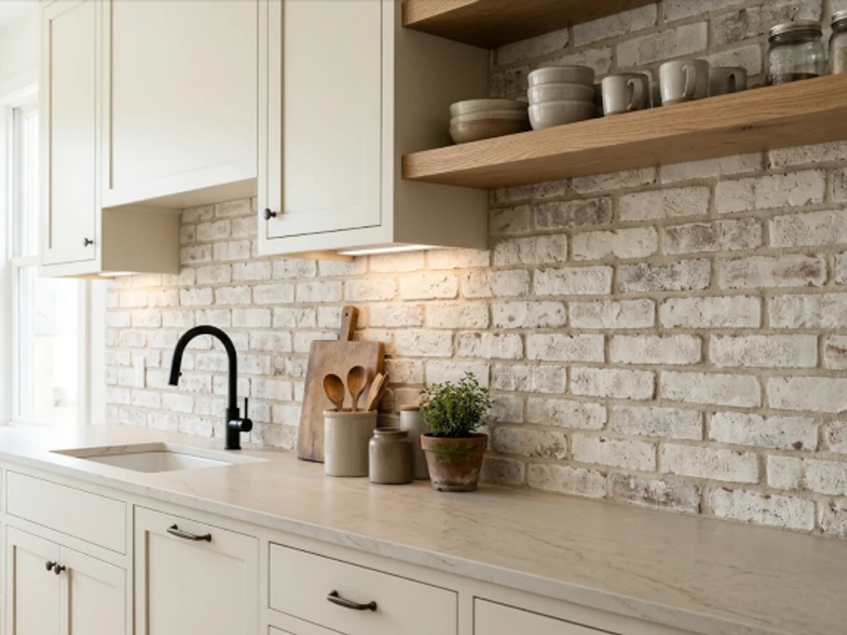
Idea 46: Sealed Brick Veneer — balancing tactile material texture and practical kitchen durability.
BEST FOR: Coordinating with natural wood and neutral cabinetry. PRO DESIGN TIP: Bring physical tile and grout samples home to inspect under morning and evening task lighting before ordering.
Glossy Black Subway Tile
Glossy black subway tile creates a sharp contrast with warm white cabinets and can make brass handles appear richer. The reflective finish adds visual depth, especially in a kitchen with adequate task lighting.
Black glossy tile shows water spots, grease, and smudges differently from pale tile, so this is a choice for someone happy with regular wipe-downs. A slightly warm black grout keeps the tile outlines understated.
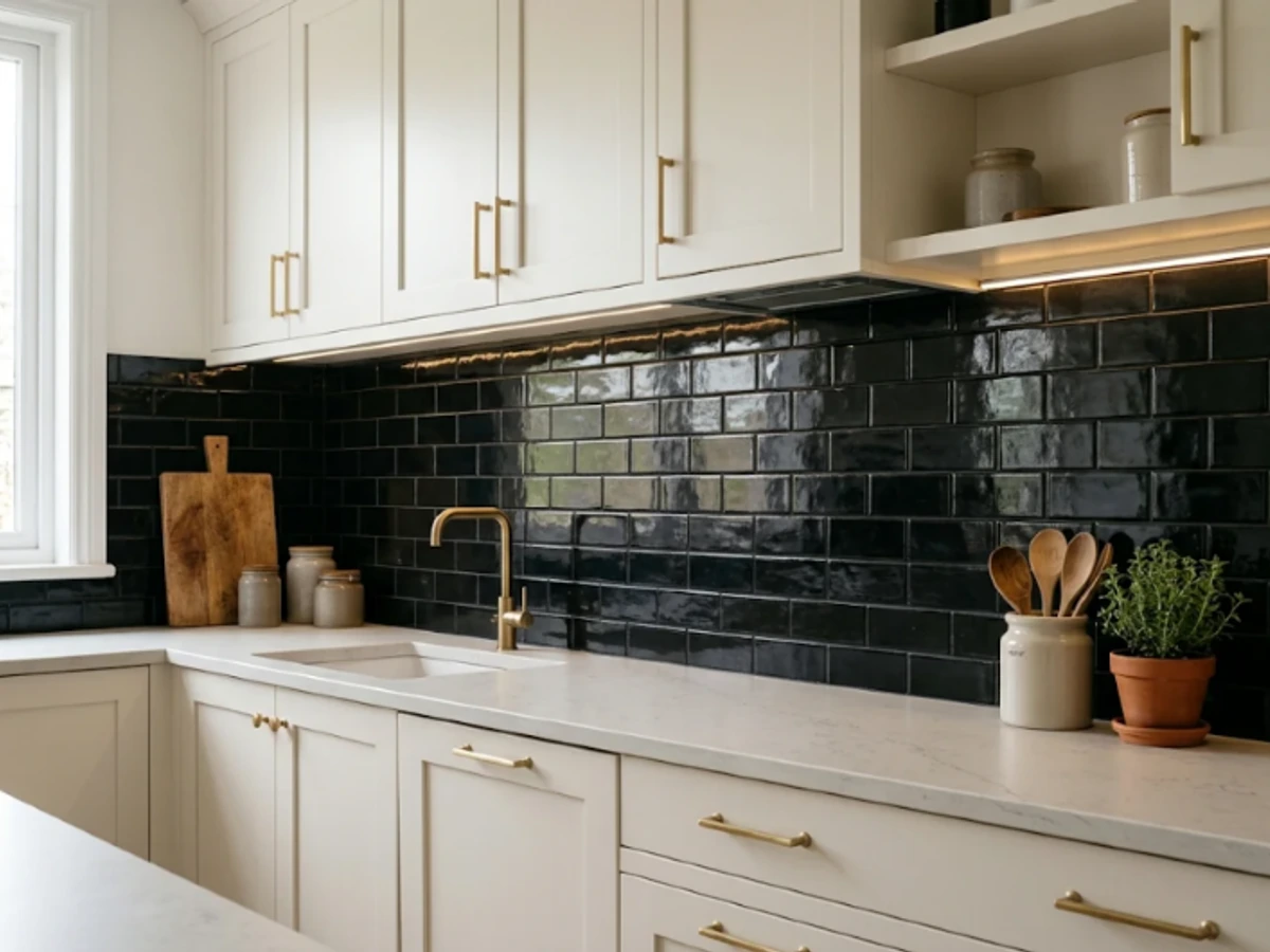
Idea 47: Glossy Black Subway Tile — balancing tactile material texture and practical kitchen durability.
BEST FOR: Coordinating with natural wood and neutral cabinetry. PRO DESIGN TIP: Bring physical tile and grout samples home to inspect under morning and evening task lighting before ordering.
Antiqued Mirror Backsplash
Antiqued mirror can give a compact kitchen a subtle sense of depth while reflecting warm pendant lights and surrounding textures. The aged patina is softer than a perfectly clear mirror, making it suitable for vintage-modern spaces.
Mirror is a specialty choice: use appropriately specified safety glazing, plan exposed edges carefully, and check suitability around heat and moisture. Expect to wipe fingerprints and splashes, even with an antiqued finish.
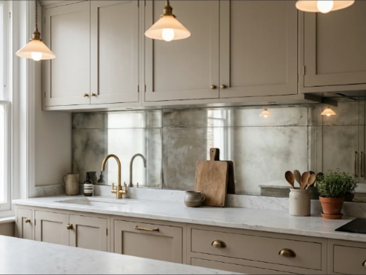
Idea 48: Antiqued Mirror Backsplash — balancing tactile material texture and practical kitchen durability.
BEST FOR: Coordinating with natural wood and neutral cabinetry. PRO DESIGN TIP: Bring physical tile and grout samples home to inspect under morning and evening task lighting before ordering.
Seamless Microcement Finish
Microcement creates a plaster-like wall with almost no visible seams, ideal for a minimalist or Mediterranean-inspired kitchen. Warm putty and limestone tones pair elegantly with oak cabinets and clay pottery.
A kitchen backsplash needs a properly specified substrate, finish, and protective coating, not just decorative plaster. Ask the installer about resistance to grease, cleaning agents, water exposure, and expected maintenance before choosing it for a high-use wall.
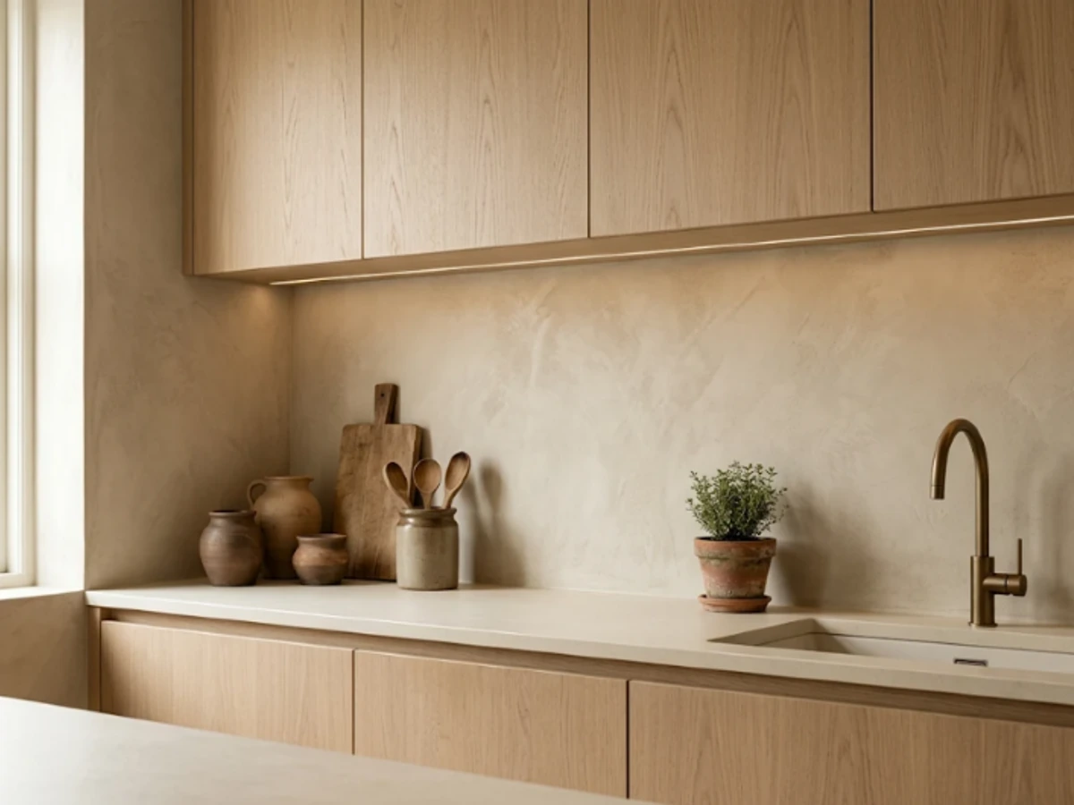
Idea 49: Seamless Microcement Finish — balancing tactile material texture and practical kitchen durability.
BEST FOR: Coordinating with natural wood and neutral cabinetry. PRO DESIGN TIP: Bring physical tile and grout samples home to inspect under morning and evening task lighting before ordering.
Hand-Painted Feature Tiles
A small field of hand-painted ceramic tiles can bring artistry to a restrained kitchen. Consider a loose botanical motif, blue-and-cream florals, or soft geometric brushwork contained behind the range or on a coffee-bar wall.
This works best when the surrounding tile is simple and the painted palette draws from existing cabinetry or fabrics. Confirm the glaze’s cleaning and heat suitability and ask for a numbered installation layout if the artwork spans several tiles.
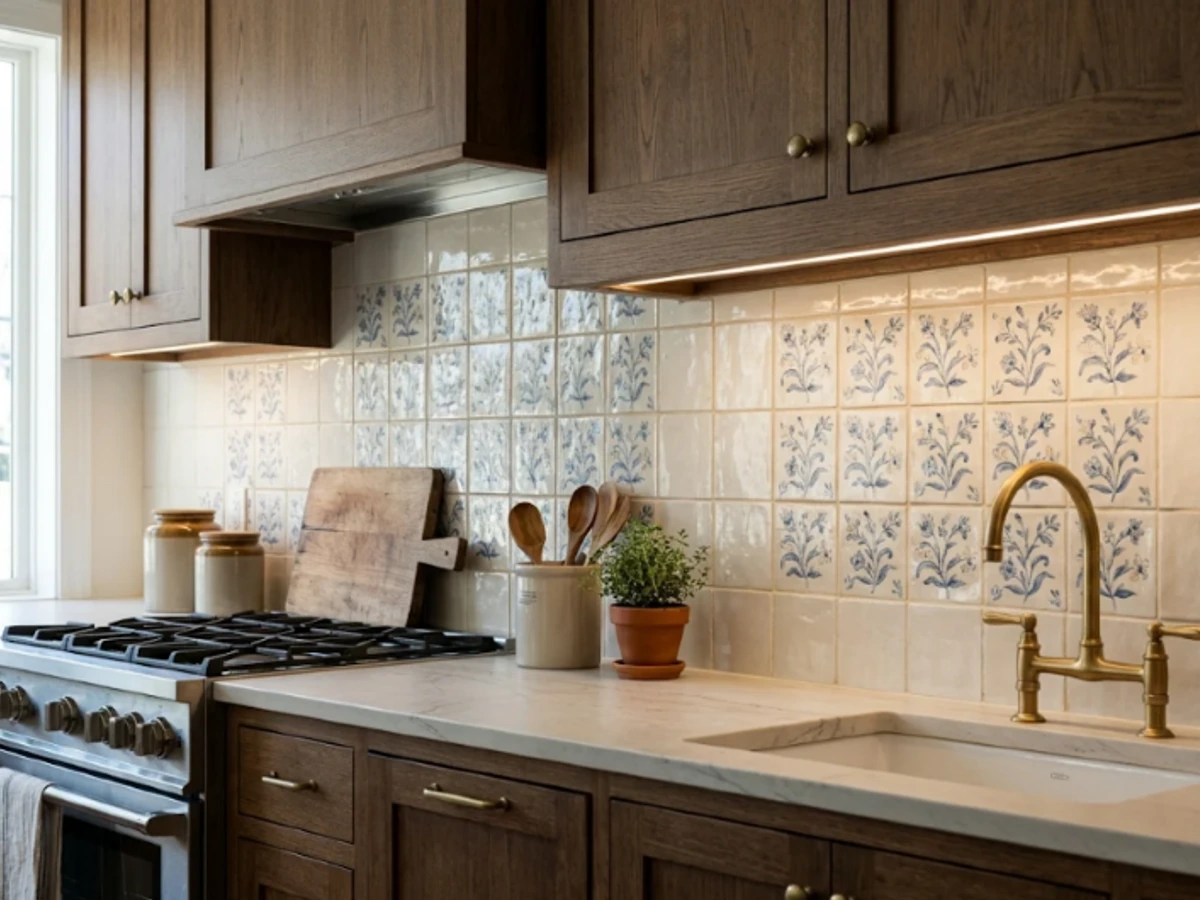
Idea 50: Hand-Painted Feature Tiles — balancing tactile material texture and practical kitchen durability.
BEST FOR: Coordinating with natural wood and neutral cabinetry. PRO DESIGN TIP: Bring physical tile and grout samples home to inspect under morning and evening task lighting before ordering.
How to Choose a Backsplash You'll Still Love Years From Now
1. Bring Samples Home Before Choosing Color
A tile that looks soft cream in a bright showroom can read noticeably pink, yellow, or sterile gray under your home's actual lighting. Place loose sample boards upright against your drywall beside existing countertops and cabinet doors. View them in natural morning daylight, afternoon sun, and at night with your under-cabinet task fixtures turned on.
2. Decide How High the Backsplash Should Go
A standard backsplash fills the 18-inch clearance between countertop and upper wall cabinetry. A full-height architectural backsplash extends continuously up to the ceiling or wraps behind an exposed range hood. While full-height stone or tile creates dramatic verticality, it increases material requirements and demands precision trimming around outlet plates and floating shelves.
3. Count the Grout Lines and Cleaning Demands
Smooth glazed ceramic rectangles with minimal grout joints wipe down effortlessly after high-heat sautéing. In contrast, intricate mosaics, unglazed brick veneers, and deep finger tiles introduce hundreds of linear feet of grout that require periodic sealing and careful degreasing. Match your tile format to how often you realistically cook and wipe down walls.
4. Match the Material to Heat and Water Exposure
A decorative wall panel beside a quiet breakfast nook operates under different physical conditions than a surface mounted directly behind a 22,000-BTU gas burner. Always confirm non-combustibility ratings and required manufacturer clearances behind cooking surfaces. Never mount vinyl peel-and-stick sheets or resin-heavy composites directly behind open flame.
5. Harmonize Finish With Your Countertop Movement
If your countertops feature dramatic, wide-vein calacatta or swirling quartzite patterns, select a subtle, monochromatic backsplash so the surfaces do not compete for visual dominance. Conversely, if your counters are solid white or uniform concrete-look quartz, your backsplash is the prime opportunity to inject handcrafted zellige movement, herringbone geometry, or artisan color.
6. Budget for the Whole Installation, Not Just the Tile
The sticker price per square foot of raw tile represents only a portion of your total investment. Remember to account for substrate prep, old tile demolition, waterproof membrane backers, bullnose trims, premium epoxy grout, adhesive thin-set, outlet box extensions, and skilled tile-setter labor.
Common Kitchen Backsplash Mistakes to Avoid
- 1Ordering From Online Thumbnails Alone: Digital photos cannot accurately reflect glaze undertones, tactile sheen, or light-bounce. Order physical sample boxes before ordering your full room quantity.
- 1Treating Grout as an Afterthought: Grout color can completely transform tile personality. High-contrast dark grout creates a busy geometric grid; color-matched grout creates a serene, continuous surface. Always request a grouted mock-up board.
- 1Failing to Center the Pattern on the Primary Focal Axis: Angled layouts like herringbone, chevron, and picture-frame insets must align strictly with the centerline of the cooking range and hood. Off-center tile cuts will immediately draw the eye.
- 1Using Fragile or Porous Finishes Behind the Range: Unsealed tumbled travertine, untreated brick, and deep fluted grooves trap grease splatters. Reserve delicate or highly textured artisan materials for low-splash beverage nooks.
- 1Assuming Stone-Look Porcelain and Real Marble Behave Identically: Marble requires pH-neutral cleaners and periodic impregnating sealers. Glazed porcelain is virtually non-porous and resists acids without sealing.
- 1Overlooking Electrical Outlet Placement: Bright white plastic outlet covers placed in the middle of a rich green or dark soapstone backsplash interrupt the focal wall. Specify matching screwless faceplates or relocate outlets under upper cabinets on plugmold strips.
Frequently Asked Questions About Kitchen Backsplashes
Final Thoughts: Selecting Your Perfect Kitchen Backsplash
The best kitchen backsplash is not simply the most dramatic trend on social media. It is the surface that harmonizes your cabinetry, flatters your countertops, and stands up gracefully to your everyday cooking habits.
Start by ordering three distinct physical samples: one timeless neutral, one gentle color or artisan texture, and one ambitious statement slab. Viewing them side by side in your home's natural light will make the right choice instantly clear.
Related Editorial Stories
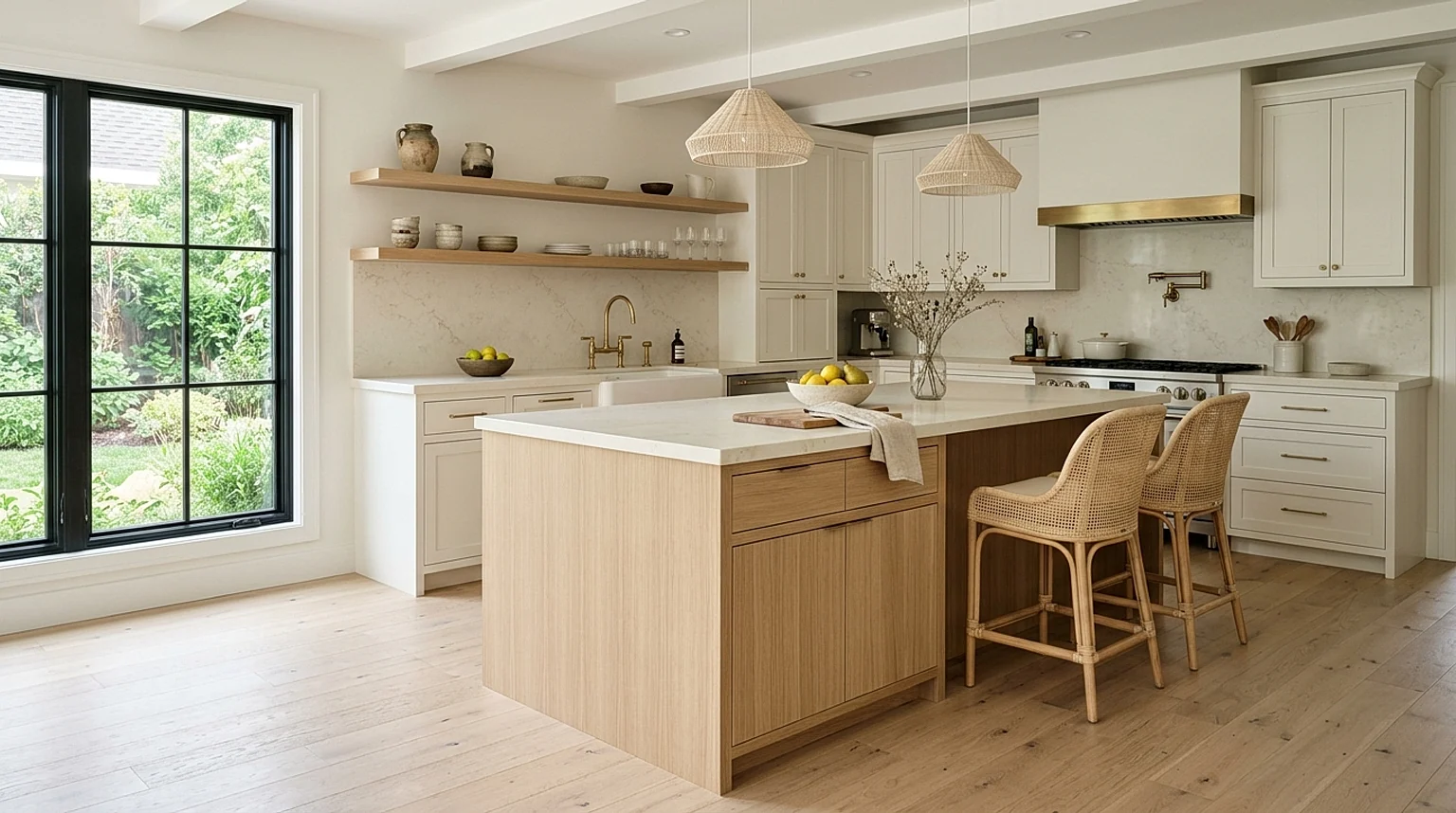
30 Kitchen Island Ideas in 2027 for Every Style, Space, and Budget
Explore 30 functional kitchen island ideas for 2027: warm white oak finishes, curved stone contours, compact rolling carts, and smart storage solutions for every layout.

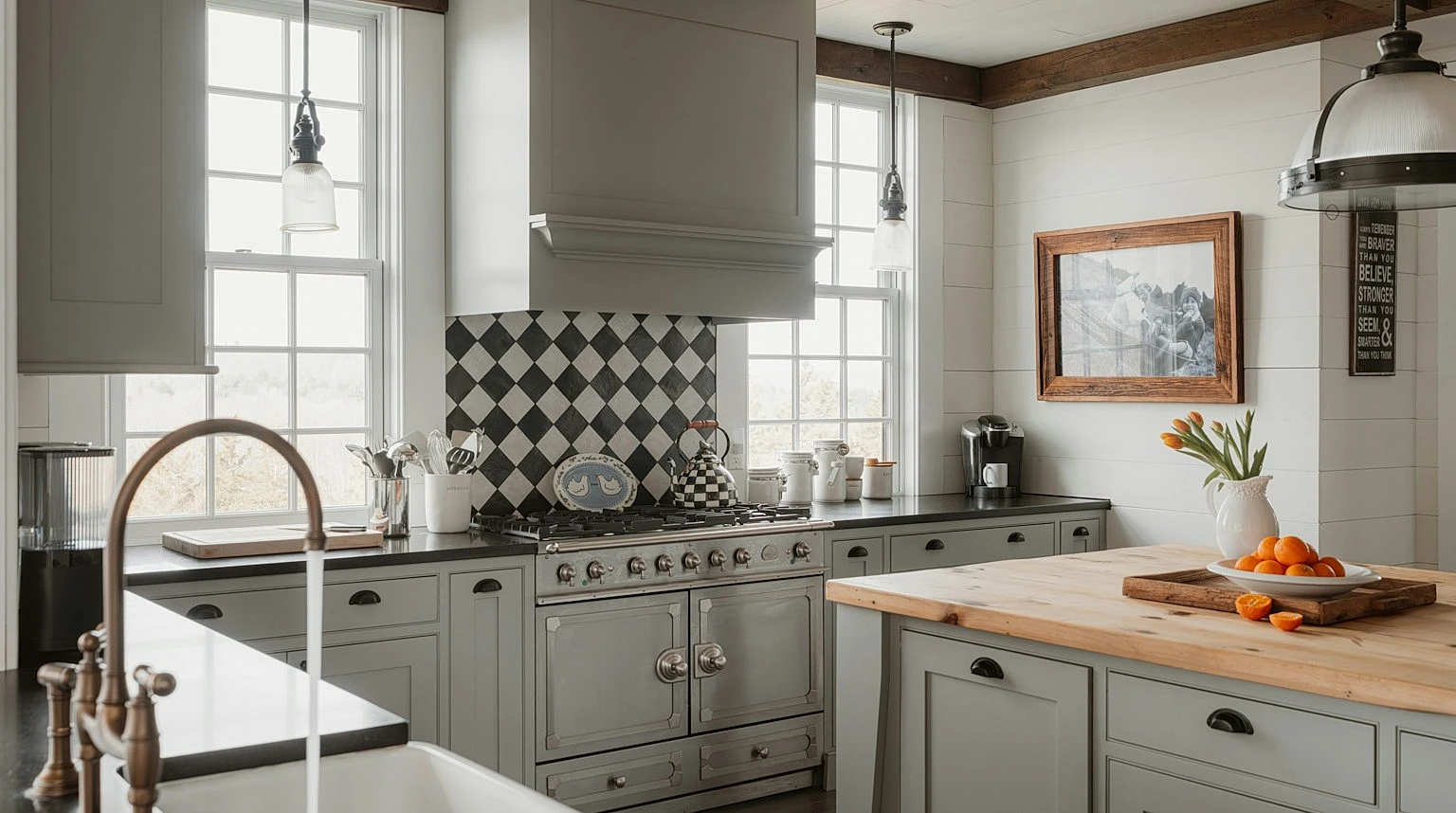
30 Gray and White Kitchen Ideas for 2027 That Feel Warm, Modern, and Timeless
Discover 30 elevated gray and white kitchen ideas for 2027: warm two-tone cabinetry, charcoal islands, marble backsplashes, brass hardware, and cozy breakfast nooks.
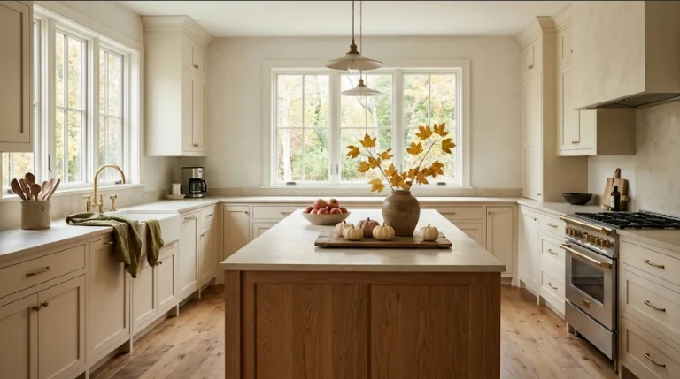
20 Fall Kitchen Decor Ideas for 2027: Cozy, Practical Ways to Welcome Autumn
Make your kitchen feel warmer for autumn without losing prep space. Explore 20 practical, clutter-free fall kitchen decor ideas—from harvest fruit bowls and olive linens to warm lamps and peg rails.